|
| Thread: [MOD TotE] Recoloured Inferno Alternatives | |
|
GenieLord


Honorable
Legendary Hero
|
 posted April 23, 2008 09:44 PM
 |
|
|
[MOD TotE] Recoloured Inferno Alternatives
LU
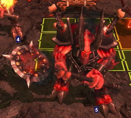
I feel that the colour of the alternative Inferno upgrades is not very pretty. Since the unupgraded ones are pink, what about simply strengthening the colour into bloody red? It looks actually good, even without the flames that the regular Inferno upgrades have. The Hell Stallion and the Pit Spawn look nice already, and their colour fits them, so I didn't mod them.
The modded creature on the left, the original on the right.
The screenshots of the original creatures were taken from AoH.
Vermin:
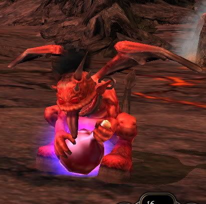 
Horned Grunt:
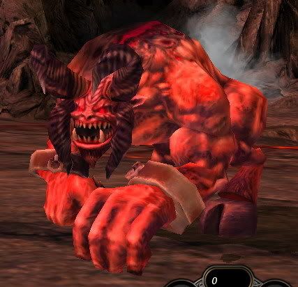 
Fire Hound:
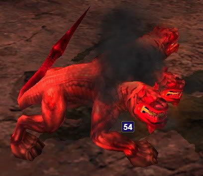 
Succubus Seducer:
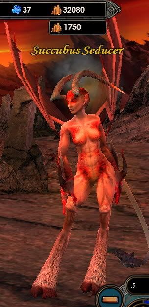 
Arch Demon:
|
|
sith_of_ziost


Promising
Supreme Hero
Scouting the Multiverse
|
 posted April 23, 2008 09:50 PM
 |
|
|
|
Bravo. I like all but the Fire-Hound. It too closely resembles the cerberus. I really like the Seducer. Good job.
|
|
GenieLord


Honorable
Legendary Hero
|
 posted April 23, 2008 10:14 PM
 |
|
|
Thank you. 
I shall post the link to the download tomorrow. Right now I'm too tired.
|
|
fiur


Promising
Supreme Hero
Map Creator
|
 posted April 24, 2008 12:33 PM
 |
|
Edited by fiur at 12:34, 24 Apr 2008.
|
they are looking great but you should add these effect on the seducers wings.. :

____________
|
|
GenieLord


Honorable
Legendary Hero
|
 posted April 24, 2008 12:47 PM
 |
|
|
Looks good!
I simply don't know how to do that, can you please explain me? 
|
|
Hellburn


Famous Hero
The efreet
|
 posted April 24, 2008 12:56 PM
 |
|
|
No offence, but I don' like the new colors. Alternative upgrades are too similar too the normal upgrades. Maybe other color?
____________
|
|
GenieLord


Honorable
Legendary Hero
|
 posted April 24, 2008 12:57 PM
 |
|
|
Quote:
No offence, but I don' like the new colors. Alternative upgrades are too similar too the normal upgrades. Maybe other color?
I'm ready to give it shot.  Just name a colour that will look nice on them, and I'll do it. Just name a colour that will look nice on them, and I'll do it.
|
|
alcibiades


Honorable
Undefeatable Hero
of Gold Dragons
|
 posted April 24, 2008 01:10 PM
 |
|
|
I don't see the difference.  Are they more red? Are they more red?
____________
What will happen now?
|
|
Warmonger


Promising
Legendary Hero
fallen artist
|
 posted April 24, 2008 01:23 PM
 |
|
|
|
Seriously I'm not impressed, they look just even more unnatural in red.
|
|
GenieLord


Honorable
Legendary Hero
|
 posted April 24, 2008 01:33 PM
 |
|
|
|
But they are much uglier as they are originally. As I said, I'm open for suggestions. If you have any idea of a colour they would look better with, tell it, and I'll execute it.
|
|
Hellburn


Famous Hero
The efreet
|
 posted April 24, 2008 02:24 PM
 |
|
|
Maybe deep orange/purple or bright teal?
____________
|
|
GenieLord


Honorable
Legendary Hero
|
 posted April 24, 2008 02:25 PM
 |
|
|
|
Nah. What about dark red with black?
|
|
alcibiades


Honorable
Undefeatable Hero
of Gold Dragons
|
 posted April 24, 2008 02:43 PM
 |
|
|
Quote:
But they are much uglier as they are originally.
It's Inferno ... they are not supposed to be pretty. 
I was skeptical about the new models when they came out, but I think in game, they work pretty fine. Sure, the faction is less coherent now, but I think in the end, it works ok [much the same goes for Necropolis: I was not keen on the pink look, but now, I've gotten used to it and don't mind much]. I think the new ones look oversaturated - I don't know what you did to them, but my guess would be you increased red colour intensity and contrast, and though they may be less ugly, they now look somewhat unnatural and don't blend well with the environment because of the high contrast. Details are also lost in the textures with this process.
____________
What will happen now?
|
|
fiur


Promising
Supreme Hero
Map Creator
|
 posted April 24, 2008 06:12 PM
 |
|
Edited by fiur at 23:46, 25 Apr 2008.
|
well I just made another version (all over darker 2'nd upr. of inferno....)
Original:

Modded:


Download
lvl.6 pic is wrong I know... but got no time to fix it atm.... in game again....
____________
|
|
Warmonger


Promising
Legendary Hero
fallen artist
|
 posted April 24, 2008 09:17 PM
 |
|
|
Way better! Now they are so mouch more grim and evil.
But in the undergound they'll be hard to see 
|
|
GenieLord


Honorable
Legendary Hero
|
 posted April 25, 2008 12:23 AM
 |
|
|
Yes, that's perfect. Downloaded! 
Thank you very much fuir, you solved the problem.
|
|
Par0l

 
Tavern Dweller
|
 posted May 03, 2008 10:36 AM
 |
|
|
 Very nice fiur! Very nice fiur!
I think they are way better than the original ones.
Good Job
____________
|
|
Disturbed-Gnu


Supreme Hero
Pro Bacon Vodka Brewer
|
 posted May 17, 2008 09:23 PM
 |
|
|
I better like them as they are original!
Yours are (in my opinion) too red, and the other one too dark/black
Don't hate me for my post 
|
|
WarLore


Famous Hero
servant of urgash
|
 posted May 20, 2008 07:08 AM
 |
|
|
Quote:
No offence, but I don' like the new colors. Alternative upgrades are too similar too the normal upgrades. Maybe other color?
i agree,for me normal color's are better  still good work still good work
____________
A Nightmare from below.A hero from Within
|
|
Kilrein


Hired Hero
Diplomat
|
 posted May 21, 2008 06:47 AM
 |
|
Edited by Kilrein at 06:52, 21 May 2008.
|
|
Personally, I love fiur's version, his indicates a more charcoal scorched representation of the alternative upgrades which is so much more intimidating. Considering that smoke is continually emitted from the flesh of the units mean make the right amount of sense.
|
|
|
|


