|
|
Salamandre


Admirable
Omnipresent Hero
Wog refugee
|
 posted January 28, 2015 10:40 PM
 |
|
|
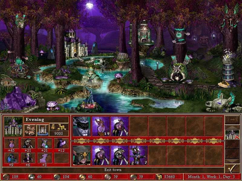
Heh, I am no expert. I think the background can be indeed dark or close to, but you need light spots here and there, strategically, in order to identify the buildings and have an artistic perspective. No light-reflects from buildings, but lights. Anyway, your town is heaven of lights, compared to Silaneo's necro.
Here grove, I hope you understand what I mean, when looking at.

____________
Era II mods and utilities
|
|
LizardWarrior


Honorable
Legendary Hero
the reckoning is at hand
|
 posted January 28, 2015 10:57 PM
 |
|
|
|
So should I put torches near buildings and such?
|
|
Salamandre


Admirable
Omnipresent Hero
Wog refugee
|
 posted January 28, 2015 11:06 PM
 |
|
|
I don't know, if I knew how to make a beautiful town, I wouldn't wait so long. 
Just saying to add the interface when considering the town screen. This way you see when it went too far.
____________
Era II mods and utilities
|
|
Stevie


Responsible
Undefeatable Hero
|
 posted January 28, 2015 11:34 PM
 |
|
|
I don't see a lighting issue in all honesty. And I think we've discussed the topic back in the day when Lizzy was still deciding on whether he should go for a daylight or a moonlight setting.
____________
Guide to a Great Heroes Game
The Young Traveler
|
|
Salamandre


Admirable
Omnipresent Hero
Wog refugee
|
 posted January 29, 2015 12:59 AM
 |
|
|
No really lightning as atmosphere, maybe just some graphical lightning elements giving more distinct shape to dwellings. A lake or river wouldn't look bad neither, especially when you can reflect the moon in.
____________
Era II mods and utilities
|
|
Macron1


Supreme Hero
|
 posted January 29, 2015 06:46 AM
 |
|
|
Oh, man, we will not see Romanian Town for another several months, if it will go further with lightning.
RT is good as it now.
|
|
Macron1


Supreme Hero
|
 posted January 29, 2015 06:49 AM
 |
|
|
LizardWarrior said:
So should I put torches near buildings and such?
In version 3.0
|
|
Galaad


Hero of Order
Li mort as morz, li vif as vis
|
 posted January 29, 2015 12:46 PM
 |
|
|
LizardWarrior said:
So should I put torches near buildings and such?
That's not a bad idea. A small river like Sal suggested sounds nice too. Overall I think you should focus on the "black" areas.
____________

|
|
LizardWarrior


Honorable
Legendary Hero
the reckoning is at hand
|
 posted January 29, 2015 01:09 PM
 |
|
|
Something like this? Not sure about the roads tough

|
|
Galaad


Hero of Order
Li mort as morz, li vif as vis
|
 posted January 29, 2015 01:17 PM
 |
|
|
I think the roads are nice.
Overall, I think your townscreen works. But due to the critics and Grove comparison I was suggesting that you focus on these areas:

____________

|
|
Silaneo


Adventuring Hero
Town Creator
|
 posted January 29, 2015 01:42 PM
 |
|
|
Wow that was fast work  Looks pretty good,i think a bit better than the previous one,still i dont know how it has to do with dwelling visibility Looks pretty good,i think a bit better than the previous one,still i dont know how it has to do with dwelling visibility  That water made me wonder - where shipyard is going to be ? I think the light in a big central hut is too strong on the top.The light should be stopped by the roof.Well I'm no light expert anyway That water made me wonder - where shipyard is going to be ? I think the light in a big central hut is too strong on the top.The light should be stopped by the roof.Well I'm no light expert anyway 
Salamandre said:
Anyway, your town is heaven of lights, compared to Silaneo's necro.
Well, I'll need to make a hell'of lights in my town too ;] The most difficult thing is to find ballance in that.Well I think your town looks already great,maybe the left side od the trees under the fort could be done a bit better,they seem to look like cut out in straight line and the left tower seems like its behind the mountain or sth.The lower part seems to blur out imo.Gj,I'll be keeping track on your town 
|
|
Humanoid


Bad-mannered
Known Hero
Rest in Peace Juvia (48-499)
|
 posted January 29, 2015 02:42 PM
 |
|
|
|
LizardWarrior


Honorable
Legendary Hero
the reckoning is at hand
|
 posted January 29, 2015 03:30 PM
 |
|
|
If I was this conversation would be rather awkward

Silaneo said:
Wow that was fast work  Looks pretty good,i think a bit better than the previous one,still i dont know how it has to do with dwelling visibility Looks pretty good,i think a bit better than the previous one,still i dont know how it has to do with dwelling visibility  That water made me wonder - where shipyard is going to be ? I think the light in a big central hut is too strong on the top.The light should be stopped by the roof.Well I'm no light expert anyway That water made me wonder - where shipyard is going to be ? I think the light in a big central hut is too strong on the top.The light should be stopped by the roof.Well I'm no light expert anyway 
Salamandre said:
Anyway, your town is heaven of lights, compared to Silaneo's necro.
Well, I'll need to make a hell'of lights in my town too ;] The most difficult thing is to find ballance in that.Well I think your town looks already great,maybe the left side od the trees under the fort could be done a bit better,they seem to look like cut out in straight line and the left tower seems like its behind the mountain or sth.The lower part seems to blur out imo.Gj,I'll be keeping track on your town 
Well, it's not gonna have shipyard. Yeah, I know about the problem with the light on the tavern, going to fix it, but got more important things to do first. I also want to add more foliage in order to cover the blurred areas, but first I have to do all buildings so I won't have buildings splitting bushes in half
|
|
Galaad


Hero of Order
Li mort as morz, li vif as vis
|
 posted January 29, 2015 04:28 PM
 |
|
Edited by Galaad at 16:33, 29 Jan 2015.
|
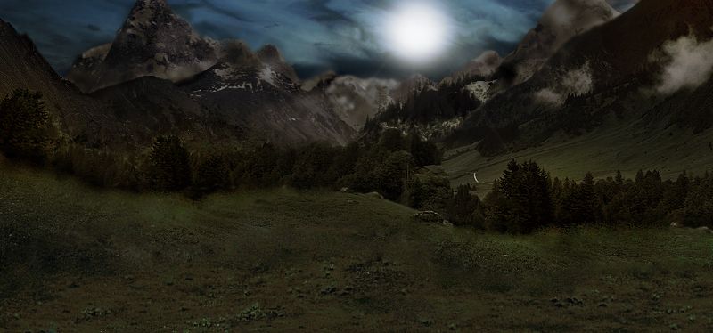
LizardWarrior, what do you think of this for the background?

Ps : Don't be afraid to be honest! 
____________

|
|
LizardWarrior


Honorable
Legendary Hero
the reckoning is at hand
|
 posted January 29, 2015 04:46 PM
 |
|
|
I like it because the trees are more visible and it's generally brighter, on the other hand it looks more like dawn and makes the lights seem exaggerated

Or a compromise: I put your background with low opacity over mine, so it still looks like night, saves me from a lot of re-contrasting and make the town brighter 

|
|
LizardWarrior


Honorable
Legendary Hero
the reckoning is at hand
|
 posted January 29, 2015 10:29 PM
 |
|
|
So far, so good. It looks pretty good in game

|
|
Storm-Giant


Responsible
Undefeatable Hero
On the Other Side!
|
 posted January 29, 2015 10:30 PM
 |
|
|
Looking good there, Lizzy. Keep up the good work 
____________
|
|
Galaad


Hero of Order
Li mort as morz, li vif as vis
|
 posted January 29, 2015 11:56 PM
 |
|
Edited by Galaad at 02:46, 30 Jan 2015.
|
LizardWarrior said:
it looks more like dawn and makes the lights seem exaggerated
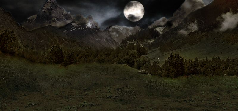
What about now?

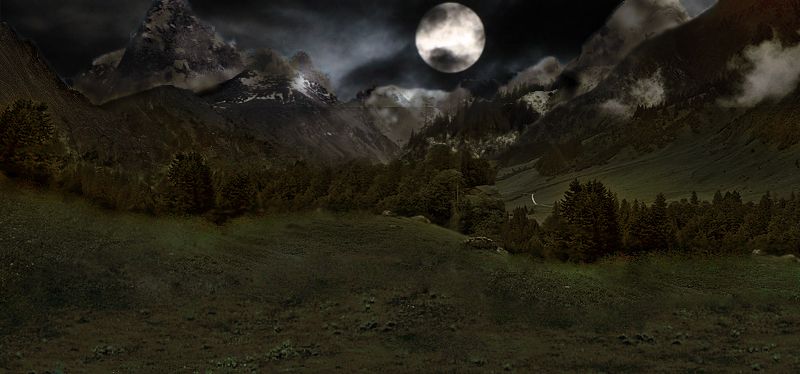
Edit: Fixed that thin line which still appears on the pic quoted by Fred.
____________

|
|
fred79

      
Disgraceful
Undefeatable Hero
|
 posted January 30, 2015 12:07 AM
 |
|
Edited by fred79 at 00:53, 30 Jan 2015.
|
Galaad said:

much better. 
|
|
Stevie


Responsible
Undefeatable Hero
|
 posted January 30, 2015 01:25 AM
 |
|
|
|
|
|


