|
| Thread: Sleeping_Sun's Necropolis Townscreen (H7) |  This thread is pages long: 1 2 3 · NEXT» This thread is pages long: 1 2 3 · NEXT» |
|
Sleeping_Sun


Promising
Famous Hero
Townscreen Architect
|
 posted September 29, 2015 11:26 PM
 |
 bonus applied by Elvin on 02 Oct 2015. bonus applied by Elvin on 02 Oct 2015. |
|
Sleeping_Sun's Necropolis Townscreen (H7)
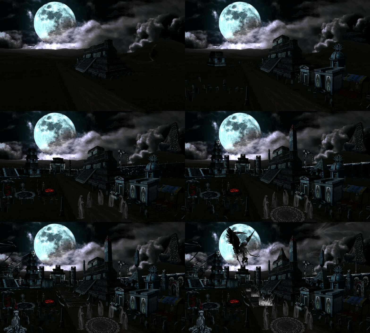
After the reveal of the townscreens, I have embarked on a journey to create my version of the Necropolis townscreen. It has been created with H7 lineup in mind. After few months, and two disasters that befell me, I finally managed to create something...
EDIT:
Necropolis Townscreen (alpha version) download link.
Townscreen development added.
Townscreen GIF added
Necro TS 00 Necro TS 01 Necro TS 02 Necro TS 03 Necro TS 04 Necro TS 05 Necro TS 06 Necro TS 07
SOON:
- List of individual buildings
- 4-5 GIF images for animated screen
UNITS AND DWELLINGS
Skeleton: Crypt - Crypt Altar
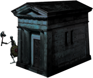 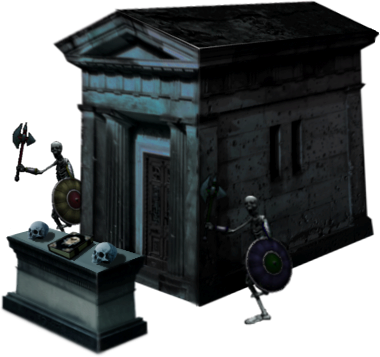
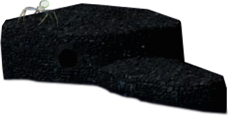
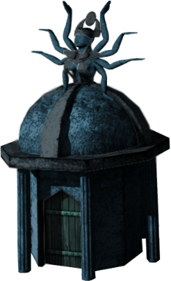
Spider: Spider Mound - Dark Crucible
 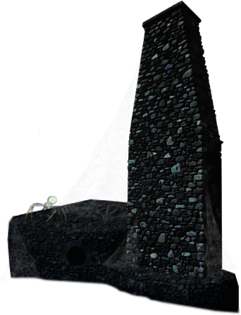
Ghost: Memorial - Soul Prison
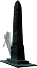 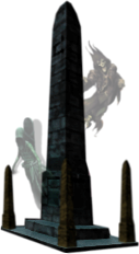
Lich: Ruined Temple - Sepulcher
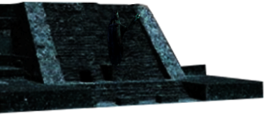 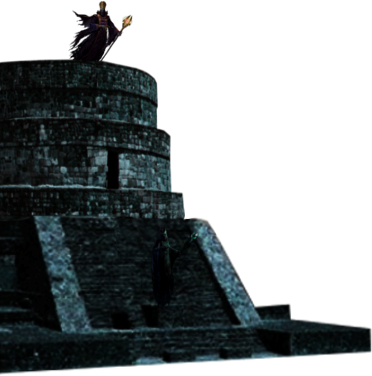
Vampire: Sanctuary - Blood Estate
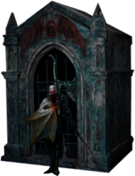 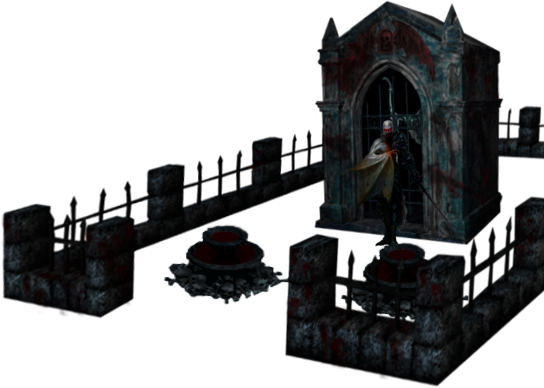
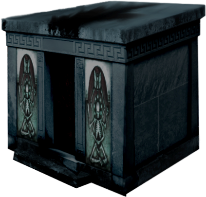
Lamassu: Tomb - Transcending Pillar
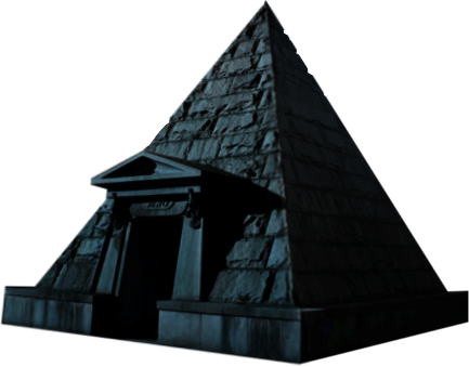 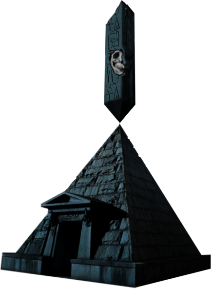
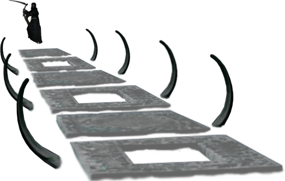
Reaper: Path of Damned - Death's Causeway
 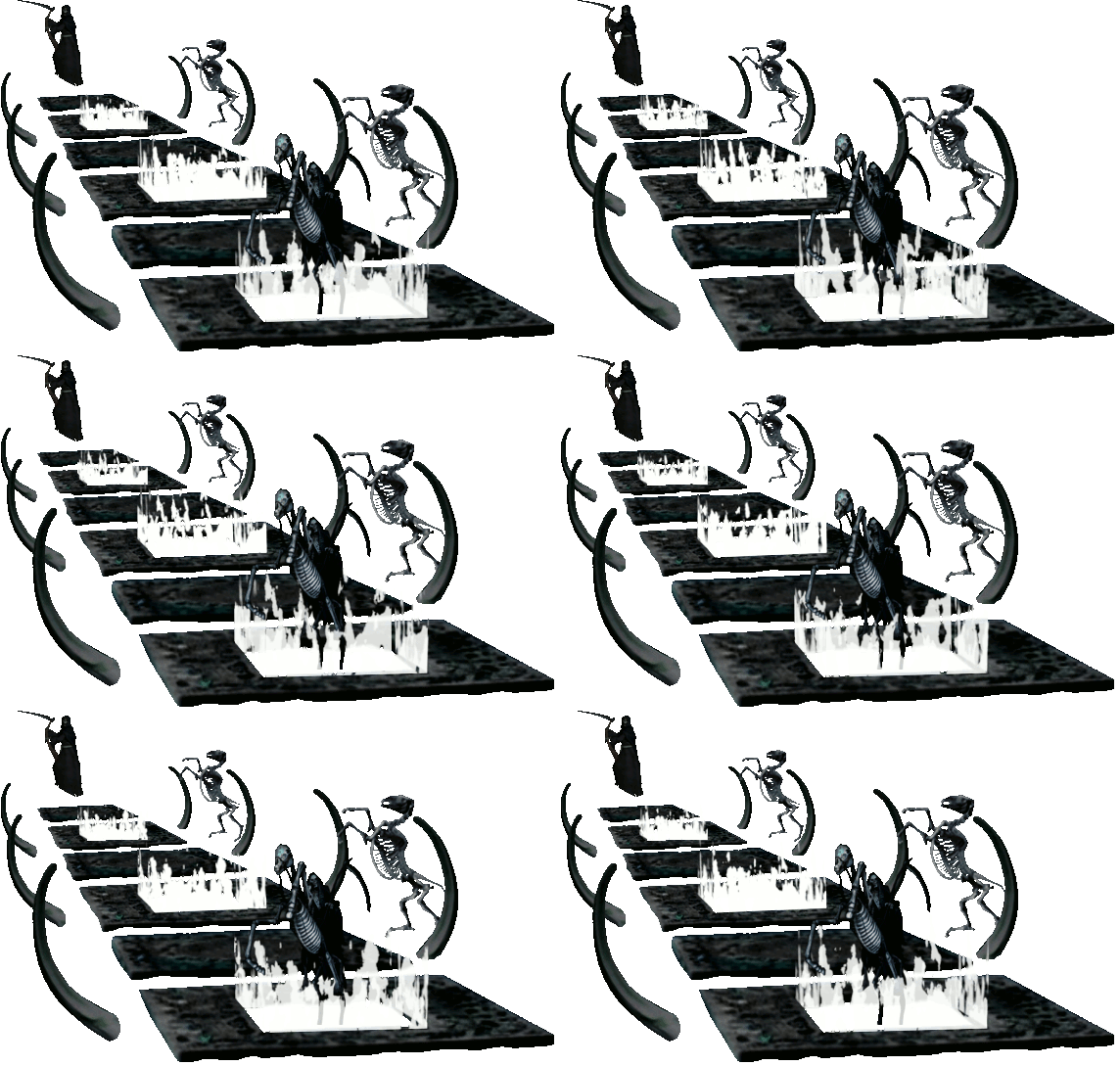
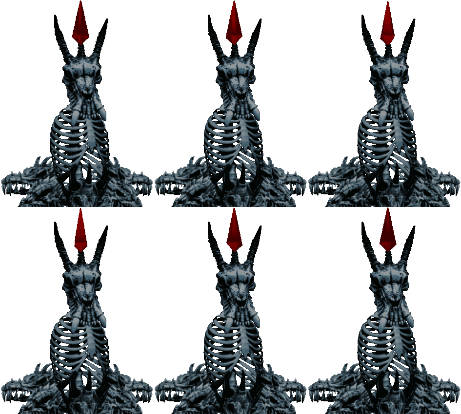
Bone Dragon: Dragon Beacon - Haunting
COMMON BUILDINGS
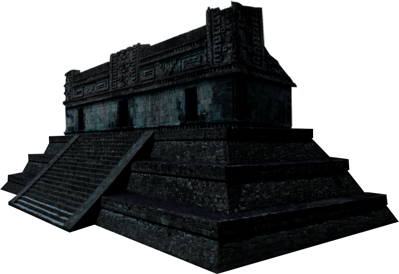
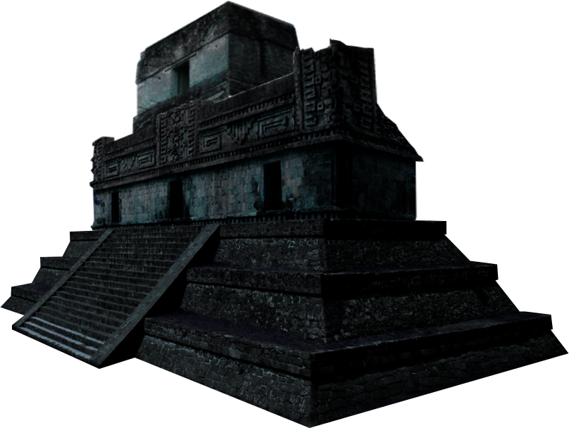
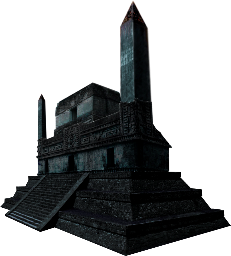
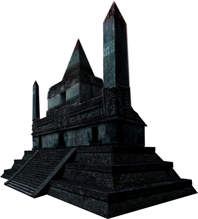
Village Hall - Town Hall - City Hall - Capitol
Tavern
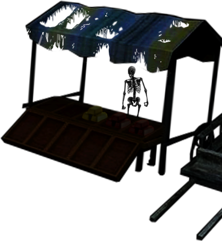
Marketplace
SPECIAL BUILDINGS (H7 name  rename) rename)
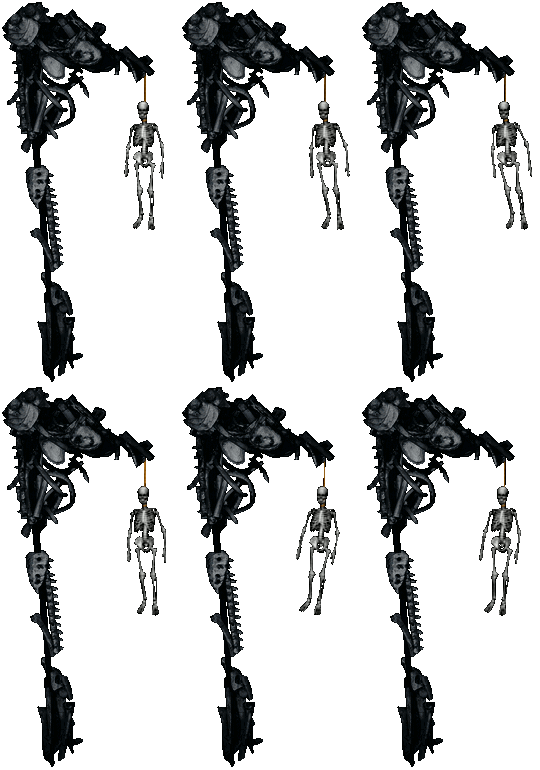
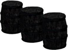
Choir of Despair  Hangman | Hangman | Asha's Hourglass  Reaper's Hourglass | Reaper's Hourglass | Namtaru Nest  Namtaru's Chamber | Resource Silo Namtaru's Chamber | Resource Silo
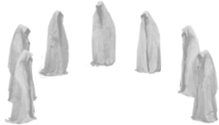
Thieves Guild  Phantom Council Phantom Council
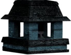
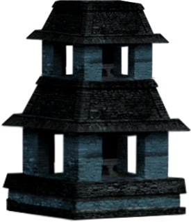
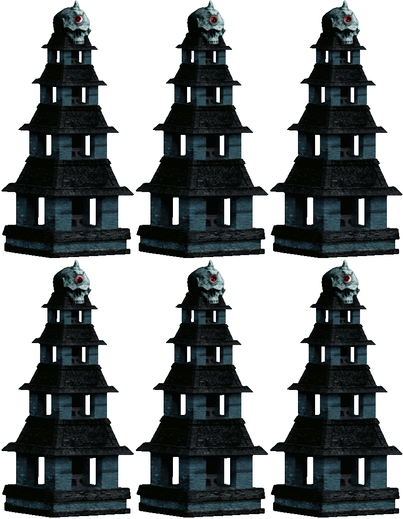
Moonlight Amplifier  Primordial Conservatory | Primordial Conservatory | Tower of Necromancy  Necromancy Amplifier | Mage Guild 1-2-3-4 Necromancy Amplifier | Mage Guild 1-2-3-4
____________
"The age can be wicked to those who walk alone. When I look into the Mirror, I see myself as I might become..." -Freya
|
|
Stevie


Responsible
Undefeatable Hero
|
 posted September 30, 2015 11:40 AM
 |
|
|
|
EnergyZ


Legendary Hero
President of MM Wiki
|
 posted September 30, 2015 11:43 AM
 |
|
|
Well, Necropolis is supposed to be dark-looking, but the issue is that you can hardly detect buildings; too dark. Well, I'd suggest making some sort of lamp posts to illuminate the buildings.
And yeah, +1 for that skeleton. Needs more undead to make the town being populated. Something that has been missing for a long time.
|
|
Stevie


Responsible
Undefeatable Hero
|
 posted September 30, 2015 11:49 AM
 |
|
Edited by Stevie at 11:49, 30 Sep 2015.
|
|
kiryu133


Responsible
Legendary Hero
Highly illogical
|
 posted September 30, 2015 11:51 AM
 |
|
|
Great except for one vital mistake: where the hell are the giant legs!?
____________
It is with a heavy heart that I must announce that the cis are at it again.
|
|
Sleeping_Sun


Promising
Famous Hero
Townscreen Architect
|
 posted September 30, 2015 11:52 AM
 |
|
|
Thanks Stevie. 
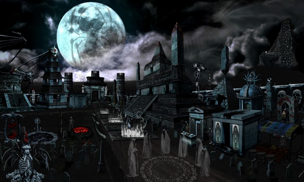
EnergyZ, the buildings are illuminated by the moon. If I make them brighter they do not go well with the background. In the previous version, the entire screen was brighter, but unfortunately two days ago (or sth like that), GIMP deleted some of the layers (the two mentioned disasters in OP) and I had to reconstruct the background from scratch, and as a consequence it is darker than the first version...
In addition, I had to make a new grail building... Galaad and LW will surely rejoice. 
Here's the old version, that is only preserved in JPG Format:
EDIT:
Stevie, I tried to do that, but it was bad, very bad...  I might try to do that again, though. I might try to do that again, though.
kiryu133, the terrain is odd. Some part is hidden by mist, but the bigger part is in same abyss or something...  Maybe it even appears from the ground... Who knows, we'll have to die to find out. Maybe it even appears from the ground... Who knows, we'll have to die to find out. 
____________
"The age can be wicked to those who walk alone. When I look into the Mirror, I see myself as I might become..." -Freya
|
|
LizardWarrior


Honorable
Legendary Hero
the reckoning is at hand
|
 posted September 30, 2015 01:40 PM
 |
|
|
Haha, nice to see that you got rid of the spider moon as I suggested  It looks astonishing, congrats man It looks astonishing, congrats man  
|
|
frostymuaddib


Promising
Supreme Hero
育碧是白痴
|
 posted September 30, 2015 01:42 PM
 |
|
|
I really like this  Great work! Great work!
|
|
Galaad


Hero of Order
Li mort as morz, li vif as vis
|
 posted September 30, 2015 01:47 PM
 |
|
|
Sleeping_Sun said:
In addition, I had to make a new grail building... Galaad and LW will surely rejoice. 

I demand this thread gets immediate +QP once there is download link. 
____________

|
|
Articun


Supreme Hero
As i dream, so shall it be!
|
 posted September 30, 2015 01:48 PM
 |
|
|
|
It's got a heroes 3 feel which is nice. Lots of ambience and the whole scenery feels filled up, like a true town should. Not bad !!!
|
|
Zeki


Supreme Hero
sup
|
 posted September 30, 2015 01:54 PM
 |
|
|
Now you only need to make the other towns
____________

|
|
EnergyZ


Legendary Hero
President of MM Wiki
|
 posted September 30, 2015 01:55 PM
 |
|
|
|
Much better. Has more logic in construction than Ubi townscreens.
|
|
Galaad


Hero of Order
Li mort as morz, li vif as vis
|
 posted September 30, 2015 01:56 PM
 |
|
Edited by Galaad at 14:04, 30 Sep 2015.
|
EnergyZ said:
Has more logic in construction than Ubi townscreens.
More importantly has a better feel.
Ps @SS: IMO would look nicer if you make an animated gif to show town construction instead of all pics after each other: from photoshop take each pic as separate layers then go to View=>Timeline=>Create Frame Animation=>Make Frames from Layers.
____________

|
|
kiryu133


Responsible
Legendary Hero
Highly illogical
|
 posted September 30, 2015 02:09 PM
 |
|
|
for some actual criticism! (yay)
crowded. Hard to really distinguish anything. buildings themselves are good and distinguishable but as a whole it's a bit of a mess with many buildings not quite getting the attention/direction/whatever they need. everything is sort of clumped together in the bottom left. The little thing in the top right corner is too small too stand out but more like that in general.
Looks like cheap CG but that excusable since I presume this is a side-project not given full attention and I'm guessing lack of professional tools/training. It's not important either but worth mentioning.
Not sure about the dragon/reaper statures. definitely too attention-grabbing and random. It's cool seeing the moon being used that way but I think the statue should be further back on not completely discernible. just a dark shape recognizable as a reaper against the moon. I'm thinking a hill/mountain going up against the moon with the statue on there as if it's watching over the town
Those are my complaints. other than that, It's great!  
good (bad?) feel, fitting architecture, plenty of bone-motifs. All-around a good screen. Not great but could easily get there with some work.
 
____________
It is with a heavy heart that I must announce that the cis are at it again.
|
|
Sleeping_Sun


Promising
Famous Hero
Townscreen Architect
|
 posted September 30, 2015 03:35 PM
 |
|
|
Thanks guys. 
Stevie, I've added the Capitol greavestones.  They are on the gif image. They are on the gif image.
Articun, with this TS I wanted to combine H3 and H7. This is a town of H7 Necromancers only in H3 atmosphere. That is why it is so much city-ish and temple-ish.
Zeki, I plan to do the rest of the factions as well, though, that will take some time... After Necropolis is done, I'll make Sylvan TS. The roller coaster has to go.
EnergyZ, it could have been better. But for the first TS, it is ok. I learned a lot by creating this one.
Galaad, I do not have photoshop, but I have nonetheless created the gif with GIMP.  Thanks for the suggestion. Thanks for the suggestion.  'Tis practical. 'Tis practical. 
kiryu133, thank you for the critical feedback!  I appreciate it. I appreciate it.  It is crowded, I agree. But there are around 45 buildings + countless gravestones (background objects) + undead units. So... it has to be crowded. It is crowded, I agree. But there are around 45 buildings + countless gravestones (background objects) + undead units. So... it has to be crowded.   However, that could have been avoided if only I had chosen a better perspective of the TS. I will do better, next time. However, that could have been avoided if only I had chosen a better perspective of the TS. I will do better, next time.
It might look like cheap CGI, but you have to understand that I am an amateur when dealing with pictures. My experience (and knowledge) is highly limited. I am also dealing with already existing pictures, and while I can break them and assemble them, colourise them and what else not I cannot do wonders. If they are not viable for TS, than I cannot do a thing. I aimed the TS to be realistic, hence I used real life pictures for the most buildings, though at times, I used the 2D pictures of 3D objects (Bone Dragon).
As far the statues are concerned... the entire city plan is flawed inherently, since it was not planned in advance. I cannot plan in advance since I cannot draw or create 3D object to work with. Depending on what I find I implement. Some buildings didn't make cut because of others... I had village hall in the beginning, and everything else was built in according to that building and around it. The Reaper statue was done this morning.  I tried several other things, but nothing was as pleasing as this. Moreover, I do not think that it is random... The moon spot was reserved for the grail building from the very start. Even in early versions, which some have witnessed. I tried several other things, but nothing was as pleasing as this. Moreover, I do not think that it is random... The moon spot was reserved for the grail building from the very start. Even in early versions, which some have witnessed.
Also, the entire background was supposed to be mountainous location. It would have been much better, but as I said, since I am not yet skilled enough, I had to implement something different and easier for me to work with, hence this current background.
____________
"The age can be wicked to those who walk alone. When I look into the Mirror, I see myself as I might become..." -Freya
|
|
alcibiades


Honorable
Undefeatable Hero
of Gold Dragons
|
 posted September 30, 2015 05:18 PM
 |
|
|
|
Not to be a spoilsport or anything, but I can hardly see anything but black in that image?
|
|
Sleeping_Sun


Promising
Famous Hero
Townscreen Architect
|
 posted September 30, 2015 05:25 PM
 |
|
|
alcibiades said:
Not to be a spoilsport or anything, but I can hardly see anything but black in that image?
Is it really that dark?  If you can't see a thing, then I might brighten things up... If you can't see a thing, then I might brighten things up...
____________
"The age can be wicked to those who walk alone. When I look into the Mirror, I see myself as I might become..." -Freya
|
|
PandaTar


Responsible
Legendary Hero
Celestial Heavens Mascot
|
 posted September 30, 2015 06:34 PM
 |
|
|
It looks interesting, Sleeping-chan.
I find this somber manner pretty much what I would expect in a Necropolis layout – I don't find it hard to see anything, btw. Or you could try making a daylight version for those who cannot see, eh? *smiles ruefully completely understanding that this task is pretty much troublesome to be done*
____________
"Okay. Look. We both said a lot of things that you're going to regret. But I think we can put our differences behind us. For science. You monster."
GlaDOS – Portal 2
|
|
ThatRedSarah


Famous Hero
Adventuring Hero
|
 posted September 30, 2015 06:40 PM
 |
|
|
Wow!   
Excellent work Sleeping_Sun. The townscreen is much better and the overall atmosphere is greatly improved! It feels like you are in the city like in H3 and not far away outside like in H7.
It is a bit dark thou. Especially the details on the bottom left. Your "original" version with the spidermoon had the lighting spot in in my opinion.
You made this in GIMP? Using random images from google and just scaling and changing the colors and levels? If so i think the results are fantastic!  
I cant wait to see the rest of the townscreens if you are going to remake them also. Even if it takes time.
|
|
Antonsky07

 
Tavern Dweller
|
 posted September 30, 2015 07:24 PM
 |
|
|
|
I think he made it with some kind of 3D software (Blender, 3DSMax,Maya) and rendered 3D scene into several pictures but that also requires tremendous amount of work.
|
|
|
|


