|
| Thread: Heroes 4 BETA screenshots (map looked nicer) | |
|
NimoStar


Responsible
Legendary Hero
Modding the Unmoddable
|
 posted May 01, 2021 06:53 AM
 |
|
Edited by Galaad at 23:09, 14 Jun 2022.
|
Heroes 4 BETA screenshots (map looked nicer)
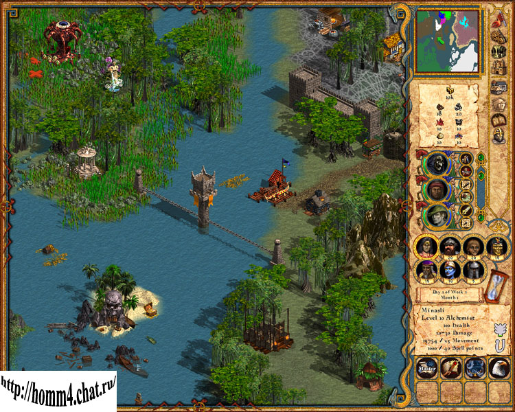
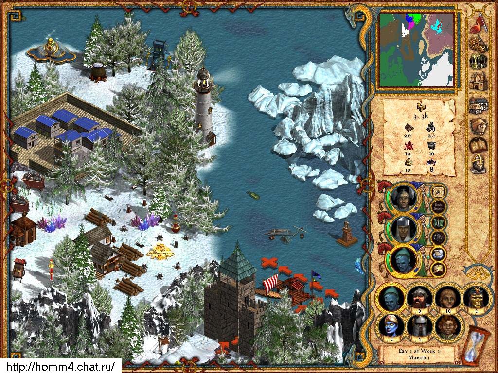
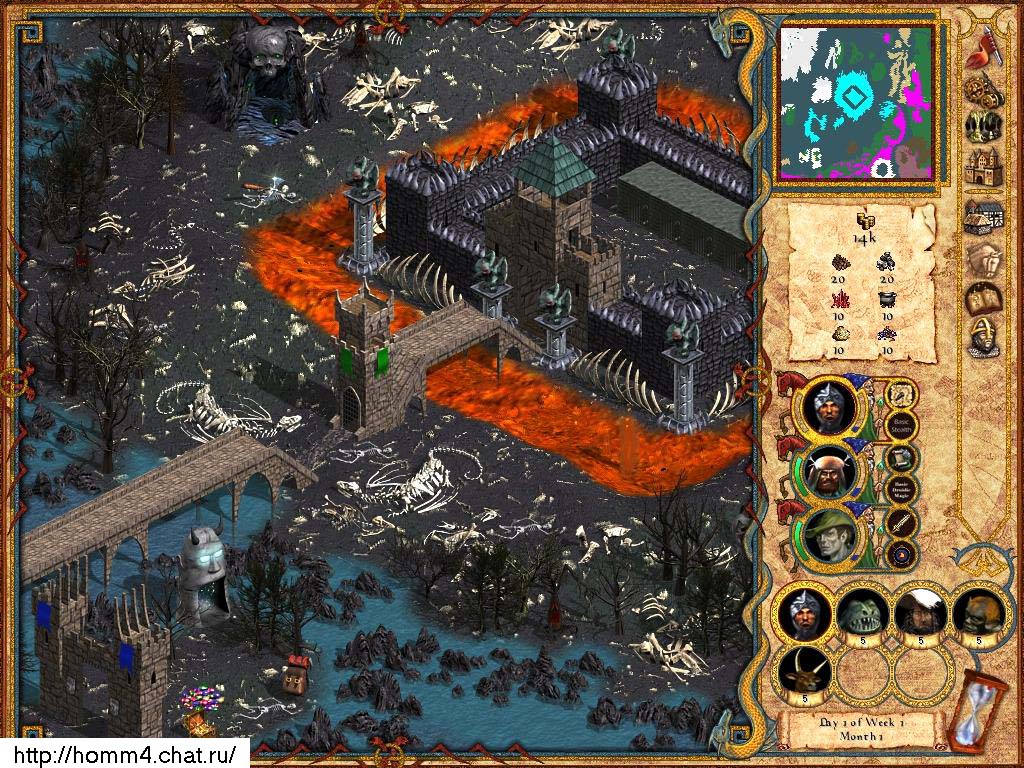
Personally, the old interface looked better, more "rich" and ancient. Except battle interface, which of course was unfinished and looked worse.
But on the map, I like this one better.
Colors also looked darker and richer and not overbright like in the game we got.
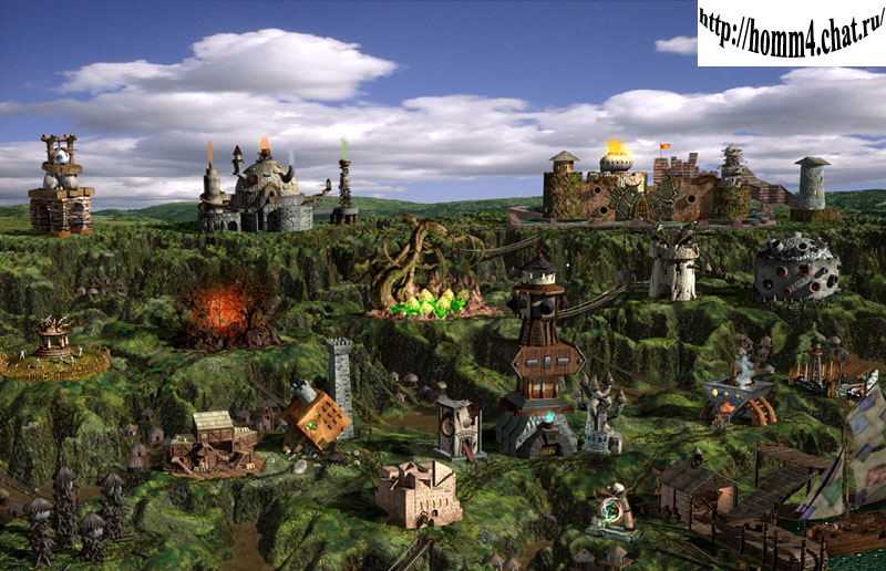
Some old objects like the Dock also look better, new ones are too big and square, "perfect" renders...
Thoughts?
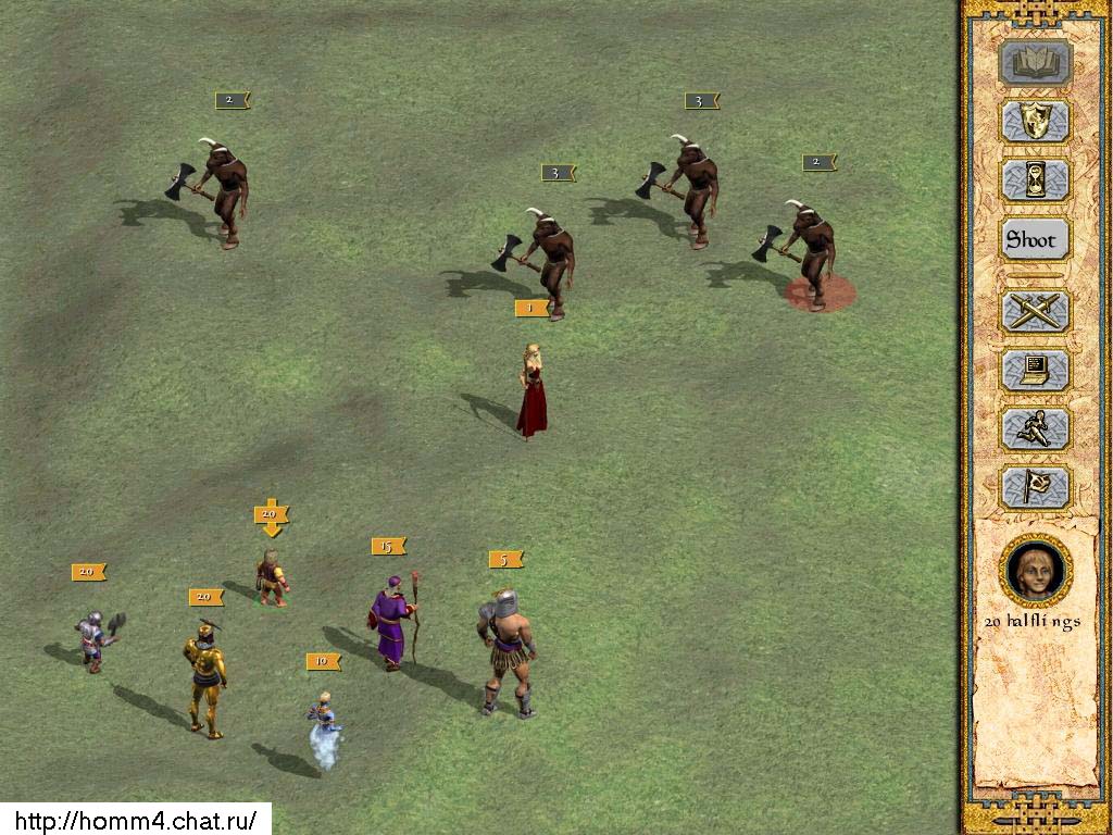
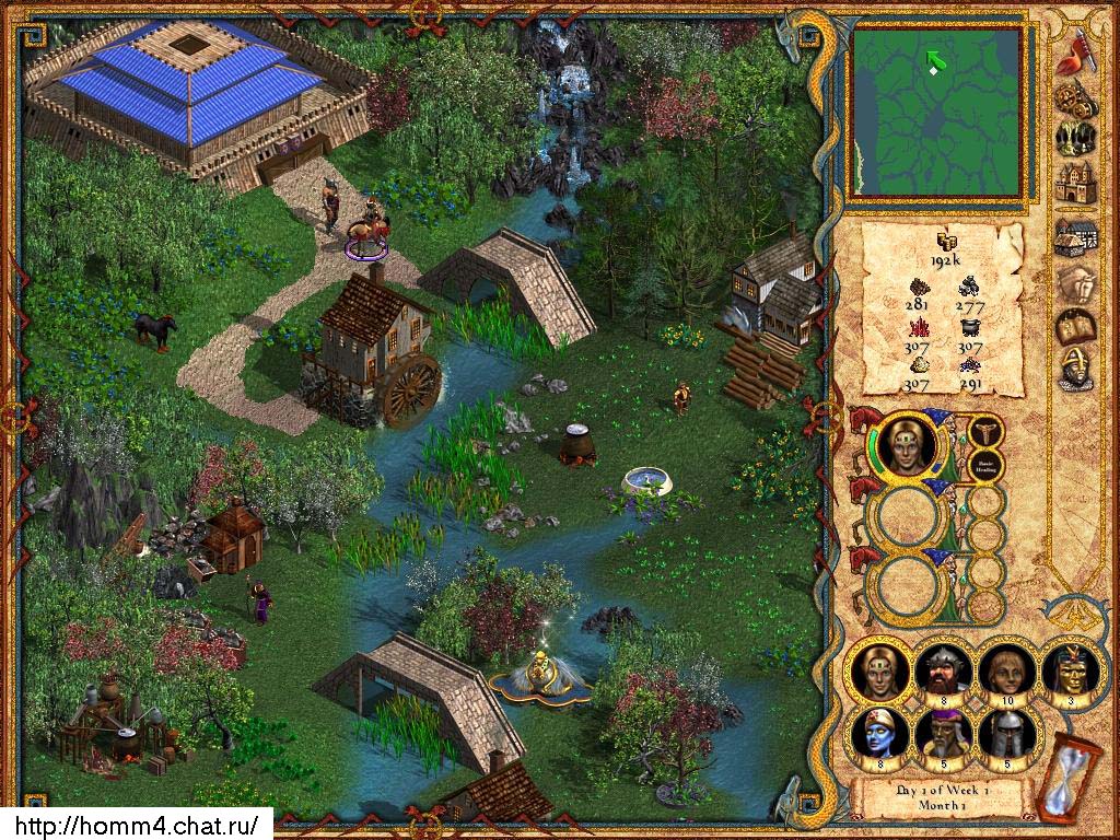
More here:
https://www.maps4heroes.com/h4_gallery.php
I wonder if keeping a darker map and map objects and not overbright interface and renders would have helped the game in the long run. I think we will never know.
Also these test maps, unlike the ones we actually got on release, look like they have some real effort put into the enviroment.
____________
|
|
Baronus


Legendary Hero
|
 posted May 01, 2021 10:16 AM
 |
|
|
|
Yes beta interface is baroque. Years ago Ive tried extract it to add ingame but its little hard because we have another size of elements. But can be done similiar.
|
|
Gandalf196

    
Disgraceful
Supreme Hero
|
 posted May 01, 2021 02:52 PM
 |
|
|
OP is right!
____________
|
|
Unknown_dark_g


Hired Hero
heroes galopping in his heart
|
 posted June 30, 2022 11:07 PM
 |
|
|
I do not like the way less nuanced minimap and the portrait backgrounds. The Shipyard looks ok but that red viking ship is terrible. XD
Creatures not having circles is something one would have to get used to.
____________
If death is worse then life then birth is is of all deeds the darkest. If life is inevitable then what is the purpose of the preverse?
|
|
NimoStar


Responsible
Legendary Hero
Modding the Unmoddable
|
 posted July 01, 2022 01:29 AM
 |
|
Edited by NimoStar at 01:33, 01 Jul 2022.
|
I like the darker renders (which I partially recreated with settings) and the UI's more medieval feel.
The minimap interface is probably just infinished thus why it only shows terrain features and no buildings. Remember it was still a Beta. Notice also how there is no Fog of War yet.
In image 1 you can see H3 style of skills...
- Water Magic
- "Master" Wisdom
- Eagle Eye (!)
- Mysticism
In other heroes you can see even Scholar.
In las image we can see First Aid. I wonder if there ever was First Aid Tent. We have no War Machines in H4.
And the hero is Alchemist class which doesn't exist sadly in H4.
____________
|
|
baronus


Legendary Hero
|
 posted July 01, 2022 08:54 AM
 |
|
|
|
Ofcourse bad minimap is only that it was unfinished. H3 icons the same. As temporary files. Still egsisting in game files! Not removed. But I like Interface! Beta Interface will be very good mod!
|
|
NimoStar


Responsible
Legendary Hero
Modding the Unmoddable
|
 posted July 01, 2022 01:09 PM
 |
|
|
I don't think it was justthe icons (though I havenever seen such files), I believe that originally a lot more H3 code was being reused as placeholder, so maybe even Eagle Eye worked on H4 at some point.
____________
|
|
|
|


