|
|
ItachiBrolly


Adventuring Hero
Child Killer
|
 posted June 23, 2010 08:52 PM
 |
|
|
Quote:
And I'm trying from some time to recreated this:

But still I have some problems... especially with some animations and dwarf dwelling... And I'm planning to bring back "originally" idea from 3DO - upg. and non-upg. dwellings will have different names... and maybe external too (and there will not be necessery to change those defs)...
Maybe someone help me with those animations? Two dwellings needs to have complete new animations (centaurs)...
WILL YOU REMAKE ALL THE TOWN SCREENS SO COOL PLEEEEEEEEEEEEAAAAAAASEEEEEEEEEEEE!
Or at least inferno and necropolis
|
|
FCst1


Known Hero
Here I am.
|
 posted June 23, 2010 08:54 PM
 |
|
|
|
FCst1


Known Hero
Here I am.
|
 posted June 23, 2010 09:16 PM
 |
|
|
Here is Morn's Rampart.
DOWNLOAD
____________
Sign up!
|
|
Kreegan


Known Hero
Winged Anquietas
|
 posted June 23, 2010 09:17 PM
 |
|
Edited by Kreegan at 21:51, 23 Jun 2010.
|
Quote:
WILL YOU REMAKE ALL THE TOWN SCREENS SO COOL PLEEEEEEEEEEEEAAAAAAASEEEEEEEEEEEE!
Or at least inferno and necropolis
Well... I don't know if I remake ALL town screens... this work was began by Morn, I only continue it 'Couse he don't work on it anymore...
EDIT - FCst1, this Rampart isn't complete... I have this package, but it still need some work... some animations, some NEW buildings (not all are in it...), and more...
____________

nick: Irhak
|
|
FCst1


Known Hero
Here I am.
|
 posted June 23, 2010 09:26 PM
 |
|
|
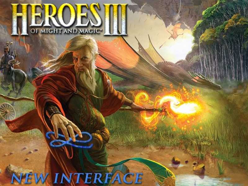
Main menu screen: (low quality, jpg..)

Good?
____________
Sign up!
|
|
gnollking


Supreme Hero
|
 posted June 23, 2010 09:30 PM
 |
|
|
Awesome, it's great  . .
____________
|
|
Avatar 


Promising
Supreme Hero
|
 posted June 23, 2010 11:07 PM
 |
|
|
Great, but... it's magic, not might at all...
____________
|
|
gnollking


Supreme Hero
|
 posted June 23, 2010 11:39 PM
 |
|
|
Lol, what does the original wog background (Dragon and the burning castle) has to do with Might and Magic  . .
____________
|
|
Trith


Adventuring Hero
Not a Hero... Just a... Nobody
|
 posted June 23, 2010 11:48 PM
 |
|
|
This menu screen is very good. But I think this strange blue thing in mage's hand doesn't fit.
____________
Forgive me my horrible English...
|
|
Cepheus


Honorable
Legendary Hero
Far-flung Keeper
|
 posted June 24, 2010 12:29 AM
 |
|
|
You guys are doing an absolutely fantastic job here. Please keep it up!
By the way if you want possible menu screens, there is this portrait by Boris Vallejo. I believe it was going to be used as cover art for Might and Magic VII, but he drew up another portrait in its place which was finally used.
____________
"Those who forget their history are inevitably doomed to repeat it." —Proverb, Might and Magic VIII
|
|
Alustor


Famous Hero
ooo da :)
|
 posted June 24, 2010 12:52 AM
 |
|
|
|
i think the one presented by FCst1 fits better
|
|
DANZA


Adventuring Hero
and stuff...
|
 posted June 24, 2010 02:24 AM
 |
|
Edited by DANZA at 02:40, 24 Jun 2010.
|
Quote:
Originally made by Kreegan, edited by me  . Only thing left is the button, DANZA? . Only thing left is the button, DANZA? 


EXELLENT!!!!!!! Good job Gnoll!! I'll add some details to those and the buttons right now!!!
EDIT: Tell me wich defs i need to modify in both of the screens, so i dont lose time xD
Quote:
Main menu screen: (low quality, jpg..)

Good?
Looks nice but I'd leave the new interface text and the blue thing behind, with the HOMM3 logo it's enough IMO. 
____________
NCPv1.5 Thread: http://heroescommunity.com/viewthread.php3?TID=33051
DOOM Rising (DOOM players): http://forum.zdoom.org/viewtopic.php?f=19&t=26302
|
|
FCst1


Known Hero
Here I am.
|
 posted June 24, 2010 07:22 AM
 |
|
|
Quote:
But I think this strange blue thing in mage's hand doesn't fit.
It new interface-logo which I have drawn 
Quote:
Looks nice but I'd leave the new interface text and the blue thing behind, with the HOMM3 logo it's enough IMO. 
In sense to place them it is direct under inscription Heroes III? There not enough place (the inscription will be on a head at the magician) is simple, therefore, I think, is below looked better...
PS. Still I will try to make an inscription "new interface" more in an original way...
____________
Sign up!
|
|
Salamandre


Admirable
Omnipresent Hero
Wog refugee
|
 posted June 24, 2010 07:25 AM
 |
|
|
|
Avatar 


Promising
Supreme Hero
|
 posted June 24, 2010 07:28 AM
 |
|
|
Quote:
Lol, what does the original wog background (Dragon and the burning castle) has to do with Might and Magic  . .
Nothing. That's why it is worse than yours 
____________
|
|
T2_2112


Supreme Hero
|
 posted June 24, 2010 07:34 AM
 |
|
|
Quote:
Quote:
But I think this strange blue thing in mage's hand doesn't fit.
It new interface-logo which I have drawn 
Quote:
Looks nice but I'd leave the new interface text and the blue thing behind, with the HOMM3 logo it's enough IMO. 
In sense to place them it is direct under inscription Heroes III? There not enough place (the inscription will be on a head at the magician) is simple, therefore, I think, is below looked better...
PS. Still I will try to make an inscription "new interface" more in an original way...
We can make something NEW like NEW loading progress for suit with the background, i love to see something like Fc1st one, have Might and Magic so clear
|
|
FCst1


Known Hero
Here I am.
|
 posted June 24, 2010 08:33 AM
 |
|
|
You have not understood me I  simply I continue work over the screen which I have shown above a little, I change inscriptions. simply I continue work over the screen which I have shown above a little, I change inscriptions.
But I understand you. 
____________
Sign up!
|
|
FCst1


Known Hero
Here I am.
|
 posted June 24, 2010 08:34 AM
 |
|
|

New variant (the permission has reduced, at me a variant in width in 1000px)
____________
Sign up!
|
|
T2_2112


Supreme Hero
|
 posted June 24, 2010 08:44 AM
 |
|
|
Quote:
You have not understood me I  simply I continue work over the screen which I have shown above a little, I change inscriptions. simply I continue work over the screen which I have shown above a little, I change inscriptions.
But I understand you. 
You do not undertand me too  , i mean we need someone like Crusader for Might, Mage for Magic in the background, the TEXT is GOOD, no need to change , i mean we need someone like Crusader for Might, Mage for Magic in the background, the TEXT is GOOD, no need to change
|
|
FCst1


Known Hero
Here I am.
|
 posted June 24, 2010 09:17 AM
 |
|
|
But this screen is better, than it is possible to find in a series of games M&M!  I wish to continue to work with it! I wish to continue to work with it!
Progress:

Buttons will look so:

____________
Sign up!
|
|
|
|


