|
| Thread: Colors of Factions |  This thread is pages long: 1 2 · NEXT» This thread is pages long: 1 2 · NEXT» |
|
cleglaw


Famous Hero
|
 posted September 26, 2014 11:22 AM
 |
|
|
Poll Question:
Colors of Factions
Monocolor - based strongly on one particular color, green for necro , red for inferno and such. like in H6. colors of factions are decieded by devs and they are identifying to each one of them.
Flexible Monocolor - based on the color you pick on game. you pick red? you get red necro. its just my idea, its may be an option too.
Multicolor - colors are not identiyfing to factions. like in H3.
P.s: my first poll, be gentle please 
|
|
War-overlord


Responsible
Undefeatable Hero
Presidente of Isla del Tropico
|
 posted September 26, 2014 11:28 AM
 |
|
|
Flex Monocolor.
So I can pick the colour I think best.
____________
Vote El Presidente! Or Else!
|
|
adriancat


Famous Hero
Protector Of The Peace
|
 posted September 26, 2014 11:30 AM
 |
|
|
Of course multicoulour, like in Heroes 3 or 5. The monocolour of the creatures was in my opinion, one of the bad decisions in Heroes 6 
|
|
supertommy


Known Hero
|
 posted September 26, 2014 11:30 AM
 |
|
|
Multicolor. Creatures in H6 was too boring when they all had the same color, too little variation.
____________
|
|
alcibiades


Honorable
Undefeatable Hero
of Gold Dragons
|
 posted September 26, 2014 11:37 AM
 |
|
|
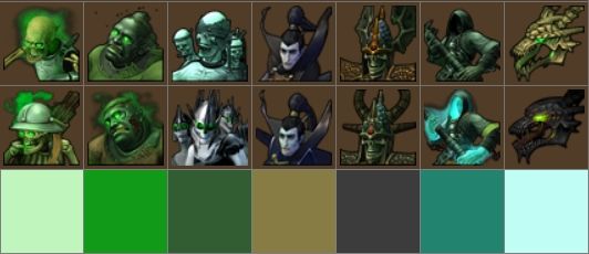
Humm I vote monocolour because that's probably closest to what I prefer, although not spot on. I do like that factions have a general colour theme, but there should also be room for variation within this theme. For instance, H5 Necropolis had a pretty good colour scheme of green/drab/black/grey/teal colours which I think was a fine example of a colour palette rather than a monocolour (see icon panel below to see these colours together). This worked because it have coherence without drowning everything in one single colour, and there were even startling outliers like the upgraded Lich's white dress which gave some morbid associations to a wedding dress which I think was extremely cool.
I definitely don't want complete multicolour where each factions has all different kind of colours (perhaps except for something like Academy where it will fit their special theme), and I don't like the idea of flexible colours that follow faction, I think the colour palette must be matched to the general artwork of townscreen etc.
Example of a nice coherent colour palette (noteice I did NOT include purple alternative upgrades!).
|
|
Doomhammer


Known Hero
Smasher of pasties
|
 posted September 26, 2014 11:41 AM
 |
|
|
|
Multicolor i think. H6 coloring was very sad.
|
|
Alex_Yakub


Famous Hero
|
 posted September 26, 2014 11:56 AM
 |
|
|
Flexible monocolor, I guess. There should be some common motif, but it shouldn't be so overused as in Heroes6
____________
|
|
Maurice


Hero of Order
Part of the furniture
|
 posted September 26, 2014 12:24 PM
 |
|
|
|
Flexible monocolor is used in many games, where accents on units are colored according to the player's main color. I like it that way.
|
|
alcibiades


Honorable
Undefeatable Hero
of Gold Dragons
|
 posted September 26, 2014 12:29 PM
 |
|
|
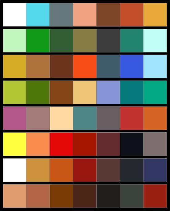
My post above got me thinking a bit more about the colour shcemes of H5, so I went back and tried to make a palette for each faction. I was actually surprised how diverse most of them were. Does this qualify as multicolour? 
|
|
Steyn


Supreme Hero
|
 posted September 26, 2014 12:31 PM
 |
|
|
alcibiades said:
Humm I vote monocolour because that's probably closest to what I prefer, although not spot on. I do like that factions have a general colour theme, but there should also be room for variation within this theme. For instance, H5 Necropolis had a pretty good colour scheme of green/drab/black/grey/teal colours which I think was a fine example of a colour palette rather than a monocolour (see icon panel below to see these colours together). This worked because it have coherence without drowning everything in one single colour, and there were even startling outliers like the upgraded Lich's white dress which gave some morbid associations to a wedding dress which I think was extremely cool.
I definitely don't want complete multicolour where each factions has all different kind of colours (perhaps except for something like Academy where it will fit their special theme), and I don't like the idea of flexible colours that follow faction, I think the colour palette must be matched to the general artwork of townscreen etc.
Example of a nice coherent colour palette (noteice I did NOT include purple alternative upgrades!).

I totally agree with Alci. One incredibly dominant colour as done in H6 is too much, but a general colour scheme/palette per faction is nice and makes the faction coherent.
I did not like that the colour palette or theme of the alternative upgrades were so different from the vanilla ones in H5. It felt like you were mixing two factions when not choosing all the same alternatives.
|
|
EPICUSDOOMICUS


Known Hero
|
 posted September 26, 2014 12:37 PM
 |
|
|
Steyn said:
alcibiades said:
Humm I vote monocolour because that's probably closest to what I prefer, although not spot on. I do like that factions have a general colour theme, but there should also be room for variation within this theme. For instance, H5 Necropolis had a pretty good colour scheme of green/drab/black/grey/teal colours which I think was a fine example of a colour palette rather than a monocolour (see icon panel below to see these colours together). This worked because it have coherence without drowning everything in one single colour, and there were even startling outliers like the upgraded Lich's white dress which gave some morbid associations to a wedding dress which I think was extremely cool.
I definitely don't want complete multicolour where each factions has all different kind of colours (perhaps except for something like Academy where it will fit their special theme), and I don't like the idea of flexible colours that follow faction, I think the colour palette must be matched to the general artwork of townscreen etc.
Example of a nice coherent colour palette (noteice I did NOT include purple alternative upgrades!).

I totally agree with Alci. One incredibly dominant colour as done in H6 is too much, but a general colour scheme/palette per faction is nice and makes the faction coherent.
I did not like that the colour palette or theme of the alternative upgrades were so different from the vanilla ones in H5. It felt like you were mixing two factions when not choosing all the same alternatives.
Totally agree with Alci and you.
____________
To die in battle is the greatest glory.
To choose to do so is the greatest honor!
|
|
RMZ1989


Supreme Hero
|
 posted September 26, 2014 01:02 PM
 |
|
|
Steyn said:
alcibiades said:
Humm I vote monocolour because that's probably closest to what I prefer, although not spot on. I do like that factions have a general colour theme, but there should also be room for variation within this theme. For instance, H5 Necropolis had a pretty good colour scheme of green/drab/black/grey/teal colours which I think was a fine example of a colour palette rather than a monocolour (see icon panel below to see these colours together). This worked because it have coherence without drowning everything in one single colour, and there were even startling outliers like the upgraded Lich's white dress which gave some morbid associations to a wedding dress which I think was extremely cool.
I definitely don't want complete multicolour where each factions has all different kind of colours (perhaps except for something like Academy where it will fit their special theme), and I don't like the idea of flexible colours that follow faction, I think the colour palette must be matched to the general artwork of townscreen etc.
Example of a nice coherent colour palette (noteice I did NOT include purple alternative upgrades!).

I totally agree with Alci. One incredibly dominant colour as done in H6 is too much, but a general colour scheme/palette per faction is nice and makes the faction coherent.
I did not like that the colour palette or theme of the alternative upgrades were so different from the vanilla ones in H5. It felt like you were mixing two factions when not choosing all the same alternatives.
Well, depends from faction to faction. Even though I love Necropolis I didn't like some of those pink upgrades either, but I loved those smoke/grey alternative Inferno upgrades.
Dungeon and Fortress alternative upgrades didn't look much different and Haven got that retribution feeling, which was great.
I don't know, I liked majority of alternative upgrade colors, but then again I didn't have much problems for H6 colors as well. Color schemes were good, but they were overdone, for example Necropolis was like in H5 Black and Green, but problem is that they were gloving, they were looking radioactive or something.
For all I care, they could still keep the same colors from H6 but tone them down a little(no more radioactive green, painful purple, blood red etc).
____________
Give a man a mask, and he'll
become his true self.
|
|
alcibiades


Honorable
Undefeatable Hero
of Gold Dragons
|
 posted September 26, 2014 01:18 PM
 |
|
|
|
Necro alternative upgrades were mostly horrible, and the Haven ones were too red for my liking (but I understand that was because they came from the campaign), the others blended in pretty well I think. For instance Sylvan's had a shift from greener colours to bluer colours, but it didn't really clash with the original palette.
|
|
Steyn


Supreme Hero
|
 posted September 26, 2014 01:57 PM
 |
|
|
Sylvan: orange or blue
Inferno: fire or smoke
Academy: blue or gold
Dwarfs: red or blue
Orcs: humanoid or demonic
Some factions (such as academy) allowed better mixing, but others were clearly divided into subfactions.
|
|
Galaad


Hero of Order
Li mort as morz, li vif as vis
|
 posted September 26, 2014 02:03 PM
 |
|
|
|
Storm-Giant


Responsible
Undefeatable Hero
On the Other Side!
|
 posted September 26, 2014 02:41 PM
 |
|
|
Multicolor. Creatures should have a 'natural' color, not the one forced by the faction they belong to.
____________
|
|
hoaheo

 
Tavern Dweller
|
 posted September 26, 2014 03:19 PM
 |
|
|
Storm-Giant said:
Multicolor. Creatures should have a 'natural' color, not the one forced by the faction they belong to.
agree  !!! Must be "natural color", not be influenced by any theme-color or so. !!! Must be "natural color", not be influenced by any theme-color or so.
Heroes VI looks bright but boring 
|
|
esvath


Known Hero
|
 posted September 26, 2014 03:57 PM
 |
|
|
|
Multi-colored creatures with faction dual colors in armor/emblem/flag/whatever to provide consistency.
|
|
Kimarous


Supreme Hero
|
 posted September 26, 2014 04:48 PM
 |
|
|
esvath said:
Multi-colored creatures with faction dual colors in armor/emblem/flag/whatever to provide consistency.
This, more or less. I like to keep some consistency within the faction lineup, but I also want them to look like distinct beings.
I'm wondering if we'll get something like that this time around. I think we might - from what I've seen of the Academy artwork, leaked and otherwise, they certainly seem diverse. The only other point of reference, Haven, looks fairly uniform... but that makes sense, given that they're a unified army.
Still, as good as red looks on Haven, I would appreciate the ability to alter their "faction" colour. Make those red wolf emblems green or something... or at least don't show us a blue faction flag and force us to use red footsoldiers.
____________
|
|
cleglaw


Famous Hero
|
 posted September 26, 2014 06:41 PM
 |
|
|

this really scares me. green al the way again?
|
|
|
|


