|
|
Warmonger


Promising
Legendary Hero
fallen artist
|
 posted March 17, 2011 02:48 PM
 |
|
|
Quote:
Will the towns be more simple to modify without great scripting abilities needed?
That's quite difficult, as towns consist mostly of interface which is hard to mod/script in general. Also, there must easy be a way to manage buildings, including special ones. Town modding will be added later than other features.
____________
The future of Heroes 3 is here!
|
|
Warmonger


Promising
Legendary Hero
fallen artist
|
 posted March 20, 2011 10:30 AM
 |
|
|
|
Alustor


Famous Hero
ooo da :)
|
 posted March 20, 2011 12:24 PM
 |
|
|
|
MattII


Legendary Hero
|
 posted March 20, 2011 08:43 PM
 |
|
|
|
Are you planning to introduce crossover option between campaigns or will we always Unholy Alliance with the same preselected heroes?
|
|
Warmonger


Promising
Legendary Hero
fallen artist
|
 posted March 21, 2011 05:39 PM
 |
|
|
I'm not sure if it's very useful feature, but you can leave your proposal in our board or bugtracker. Moving heroes between maps is the last thing to be implemeted soon.
____________
The future of Heroes 3 is here!
|
|
Warmonger


Promising
Legendary Hero
fallen artist
|
 posted April 25, 2011 10:51 AM
 |
|
|
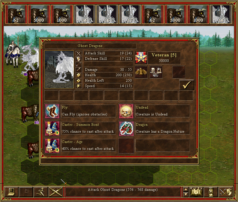
You would never guess...

This screenshot shows attempt to handle special spell-like abiliies and the fact that now neutrals are split into multiple stacks.
Also, I've got some good news about AI. Tow, leader of the project and our guru, got adventure AI accepted as engineer thesis so now it just has to come sooner or later.
____________
The future of Heroes 3 is here!
|
|
solitaire345


Promising
Famous Hero
|
 posted April 25, 2011 10:59 AM
 |
|
|
Huh? 75% chance to summon boat?
____________
|
|
ByteBandit


Promising
Famous Hero
Soul Merchant
|
 posted April 26, 2011 06:37 PM
 |
|
|
Wow! I like the way the screenies show special abilities!
____________
|
|
songfx


Adventuring Hero
|
 posted April 27, 2011 02:05 PM
 |
|
|
Is it possible to show all spell affecting the army? It will be better to use left and right arrow to check spells, the same as the backpack in the hero screen.
____________
Chinese WOG Forum
|
|
Warmonger


Promising
Legendary Hero
fallen artist
|
 posted April 27, 2011 03:06 PM
 |
|
|
Well, there are ten spell slots visible and hopefully it's enough. I don't think that adding arrows would make it better, but could make things less clear. But of course your proposal is resonable.
____________
The future of Heroes 3 is here!
|
|
Salamandre


Admirable
Omnipresent Hero
Wog refugee
|
 posted April 27, 2011 03:49 PM
 |
|
|
|
In WoG there are 8 special abilities, 2 were removed?
|
|
Warmonger


Promising
Legendary Hero
fallen artist
|
 posted April 27, 2011 06:06 PM
 |
|
|
|
Salamandre


Admirable
Omnipresent Hero
Wog refugee
|
 posted April 27, 2011 06:10 PM
 |
|
|
|
Warmonger


Promising
Legendary Hero
fallen artist
|
 posted April 27, 2011 06:14 PM
 |
|
|
|
Salamandre


Admirable
Omnipresent Hero
Wog refugee
|
 posted April 27, 2011 06:19 PM
 |
|
|
|
Aaa, you plan to set abilities to more than 8? The perfect creature will be possible then.
|
|
itsjustme


Promising
Known Hero
|
 posted April 27, 2011 06:52 PM
 |
|
|
|
And make two lines for description of abilities. Will be better for long description.
|
|
Warmonger


Promising
Legendary Hero
fallen artist
|
 posted April 27, 2011 09:19 PM
 |
|
|
Quote:
The perfect creature will be possible then.

I'm thinking about modifying WoG artifacts just for testing purposes. May be funny :]
Quote:
And make two lines for description of abilities. Will be better for long description.
You're right, current descriptions have been severly truncated. There may be two lines (which hardly fit, and may be difficult to break), or bottom label may be used to display longer text during hover.
Every option is possible, but why didn't you share these ideas two months ago? 
____________
The future of Heroes 3 is here!
|
|
Salamandre


Admirable
Omnipresent Hero
Wog refugee
|
 posted April 27, 2011 09:28 PM
 |
|
|
For me it is a bad idea to park too much information in a such restricted space. For example, in battle, having to scroll to see all infos is not better than original, but worse. I would make the dialog 800x600 and put everything inside, viewable fast and friendly. Also several icons position do not fit with the others, it looks like two screens were hardly pasted altogether. The most important in an Heroes battle is to get all info you need in a global view, and compare. no matter how many screens you use for that, each one must be complete, without hidden infos under the sidebar.
Think player, not programmer.
|
|
Warmonger


Promising
Legendary Hero
fallen artist
|
 posted May 26, 2011 04:34 AM
 |
|
|
|
Warmonger


Promising
Legendary Hero
fallen artist
|
 posted June 02, 2011 03:12 PM
 |
|
|
|
|
|


