|
|
yogi


Promising
Famous Hero
of picnics
|
 posted August 21, 2014 04:46 PM
 |
 bonus applied by alcibiades on 21 Aug 2014. bonus applied by alcibiades on 21 Aug 2014. |
Edited by yogi at 02:07, 22 Aug 2014.
|
Limbic's Town Screens
Ok, this topic definitely deserves its own thread. The community obviously places a lot of importance on the town screens, so let's discuss them until our eyes bleed to give the devs a clear picture of the best way to work them.
Try not to just complain about what you've seen thus far, but also provide constructive suggestions for the devs.
@Limbic: please take what you find in this thread as tough, but constructive criticism. We know that what you are working on is not easy, but you can do it!
First, for my personal opinion, I'll just come right our and say it, I really don't like the town screens we've seen from Limbic's thus far. Aside from all the bugs in H6, they were the number 1 deterrent for me not being able enjoy the game. They look like landscape paintings with a bunch of stuff just tossed willy nilly all over the place with no rhyme or reason, and no "town" structure or organization whatsoever; and with the quality reminiscent of a school project that I might stumble upon on deviantart, albeit a good one. The animations are ok, but the buildings are all at different angles and many times in different perspectives. Everything just doesn't come together very well, they don't feel like "towns" as much as portfolio pieces showing off a bunch of buildings. I actually stopped playing H6 when they patched out the town windows, which I actually liked, without giving us a choice in the options menu. At least with the town windows the adventure map background gave each town a somewhat unique feel, sorta similar to the terrain in H4 influencing the background of the town screens.
In contrast, H3 and H5 had beautiful town screens, that actually had coherent designs and looked like, you know, towns, or cities. H4 and H2 didn't look too bad either. Again, all the ones I've seen from Limbic so far have little to no cohesion, with buildings just tossed all over the place at different angles and with different perspectives.
Now I'm just going to pull in a bunch of quotes from the H7 discussion thread to get the ball rolling.
Kivo said:
I have to say that I feel quite dissapointed with the Haven townscreen. Looks better than the H6 one, but its still not right. *snip
The shadows are also not right! Just like in the Haven townscreen in H6! Someone who has contact with the devs, please report this! 
This leads me to a question, perhaps Elvin knows the answer: are the townscreens final?
Great question. Elvin, do you know
esvath said:
Town screen is good, but why do the artists choose to draw the town screen from outside of the town? It is weird when I am entering the town and I am positioned at the outside of the town still. I feel there is a distance between me and the town, unlike previous games where I would be immersed in the town's atmosphere as soon as I am entering it. Even Heroes VI's town screen is somewhat "closer to the inside of the town" than these ones.
 After thinking about it for a bit, you may have just pointed out the main reason that the new screens feel off to me. Again, they look like landscape paintings with buildings just tossed on, and not at all like I am in an actual town... After thinking about it for a bit, you may have just pointed out the main reason that the new screens feel off to me. Again, they look like landscape paintings with buildings just tossed on, and not at all like I am in an actual town...
radar said:
Totally agree. I much preferred the take where the town is oriented towards the player, it's you who's playing the game after all. This weird angle just makes it less appealing to me.
Zeki said:
I don't really like the town screens, there are almost only the special buildings and just a few background buildings like, where do the people live? that's no town! H6 was the same and maybe H4, too, don't remember right now. Just think back to H3's townscreens, they had alot of small houses all over the place and got even more when you upgraded the castle, as it would be only natural.. Or just remember H5 Heaven town screen, now that was a massive city with thousands of houses. Now it feels like a big castle and nothing more :/
 This is another great point: where are the actual "towns"? This is another great point: where are the actual "towns"?
alcibiades said:
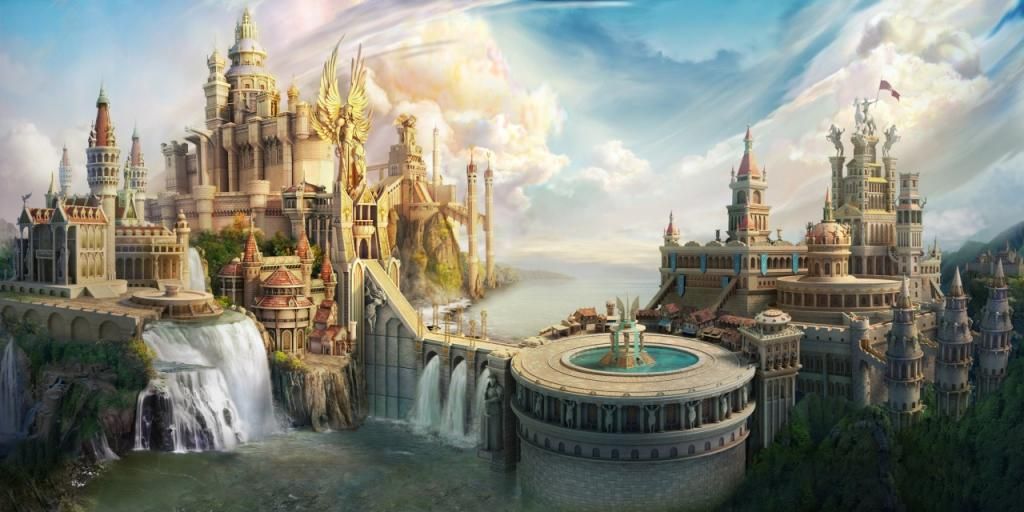
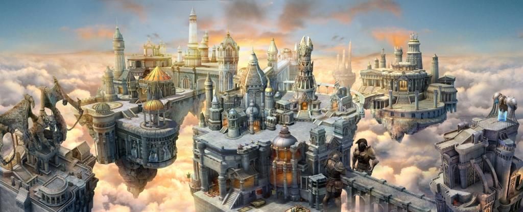
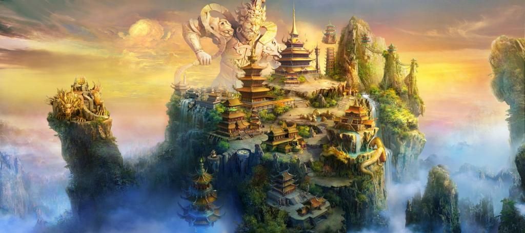
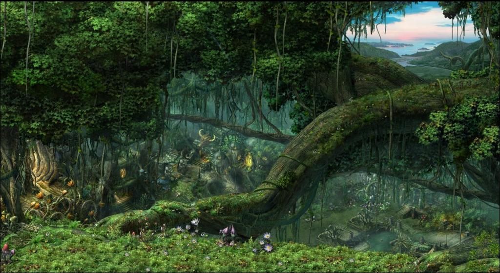
Beautiful artwork, with unified perspectives and cohesive designs that actually have organized city structures! Still a bit too distant for my tastes, but worlds better than what we've gotten from Limbic so far.
red_flag said:
Naze said:
Since Alcibiades (re)started the topic, I still believe no 2D town screen beats these ones...
Now I have an urgent need to play the game one more time.
Functionality? What functionality? Just take a look at the master Heroes 3 townscreen and Heroes 7. Do you see the difference in number, size, distance and recognizability of the buildings between them?
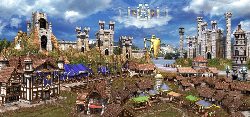
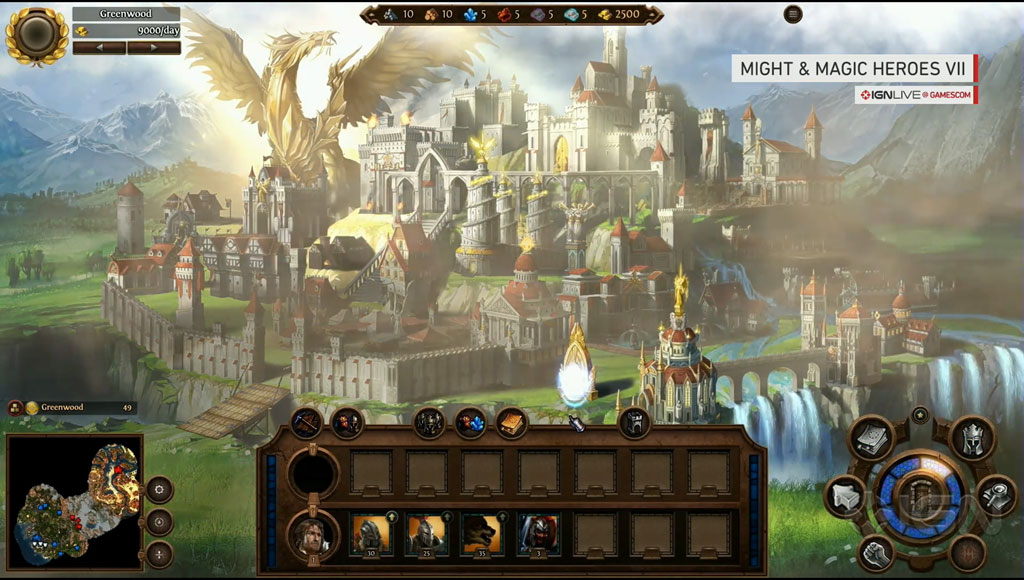

I can't feel any usability in the current Heroes 7 2D townsceen, all I need - it's several buttons in the corners or some.
So why they do 2D? It's cheaper? If so - it's ok, I understand. But don't say me about functionality of the current 2D screens, they not 
Besides they are also absolutely not impressing in difference from those that posted alcibiades 
^These 3 images side-by-side like this does a wonderful job of demonstrating many of the concerns pointed out in this thread, so I include them.
Dave_Jame said:
What would in my eyes be a nice idea is that each faction could have 2-3 different town screens that would randomly alter in each castel. This way, each castel could feel more individual and the whole game wourld would look more lively.
Brilliant idea! Unfortunately I can fathom how much additional work this would be, so I think Heroes 4 approach of just having different landscape background is much more viable..
Fal-Parsi said:
That's a good idea. I also liked how in Heroes IV the ground of the towns varied whether they were situated in sands, snow, swamp, grass...
red_flag said:
No doubts Heroes 3 townscreens is the best, but in Heroes 7 they not functional and not beautiful, that isn't pleasant to me. They don't reach on functionality to Heroes 3 and on beauty to both Heroes 3 and 5. That's sad.
properkheldar said:
The H7-townscreen isn't that great imo..
Like in H6 it's perspective is a bit off. Lines doesn't follow each other, things look a bit out of place. Maybe it's a work in progress.
Does anyone know if these are just alpha Works In Progress
alcibiades said:
The actual town screen in H5 was just eye candy, but you had easy access to everything from the UI menus in the bottom.
Yup. In my opinion the 3D town screens in H5 were not only the most beautiful of the series yet, but also some of the most beautiful 3D landscape models ever done; and the highly functional UI eliminated any issues that may have arisen as a result of the translation from 2D to 3D. Static perspectives of 3D models, such as were in the beta of H5, would be wonderful as well; and probably easier and more cost-effective than paintings too.
Naze said:
If functionality is, what you seek, then H6 pre-patch town windows are good enough. You can build buildings, hire troops... it contained all the functionality required. Or, we could be even more minimalistic, and use just side panels, like in Age of Wonders 3. For functionality, you need just buttons, not town screens... So I find your argument rather invalid.
Town screens have always been there just for the pleasure of eye (and ear). So, if I cannot have the pleasure of epic, magnificent 3D rotating town screens, and all I get is crappy 2D picture with every building depicted from different point of view, I could rather be without town screens. The 3D models in the world map look better anyway.
I'm with ya! 
Avirosb said:
Either people are extremely large when crossing the drawbridge or they're gonna have a hard time climbing those stairs.
Ha, great point Another example where the perspective is just off.. Another example where the perspective is just off..
Maurice said:
I must admit I hadn't noticed that either. In fact, the more I look at that picture, the more I notice how weird the various perspectives are. You can see windows and doorways in the bottom right section, which are smaller than their counterparts in the center of the town.
Also, something irks me a great deal about the wall in the lower left. It somehow seems the perspective on that wall is completely off, but I can't put the finger on it.
It doesn't get any smaller as it recedes into the distance like it should.
Dave_Jame said:
Actually I think the Haven TS looks bad, very bad
Why? it deos not look alive!
There are almost no Buildings.
No smoke from the houses (like in Heroes V)
No people or creatures.
And all buildngs just look like glued on a generic green background.
For me, the best TS were in Heroes II where each added building gave the feeling of your town getting biger, while still figing into the whole.
 I think you may have just hit another nail on the head. The town screens need to be uniform: where they feel whole even from the get-go, just getting more full as they develop. This is not easy by any stretch of the imagination, but as H2, H3, and H5 have shown us, it is possible. I think you may have just hit another nail on the head. The town screens need to be uniform: where they feel whole even from the get-go, just getting more full as they develop. This is not easy by any stretch of the imagination, but as H2, H3, and H5 have shown us, it is possible.
blob2 said:
Let's be frank. The artist that drew this townscreens is probably the same that drew them in H6. This guy draws nicely, but his buildings are off scale, crooked, lose the perspective, and many look like they were glued to the base without much consideration for the esthetic side. And there are multitude of examples, just look on the Academy art.
I like 2D town screens, but maybe they should try a different artist, or try to render them, like in H3, because it looks like it was done in a hurry...
Neovius said:
I think the town screens would look a lot beter if they added ambient occlusion styled shadows where the buildings touch the ground. Or made the buildings have the same brightness as the scene (look at the tavern on the left side of the stairs).
Right now it looks like they drew those building separately without the background in mind and then just pasted it there.
@Limbic: given that it looks like the landscape backgrounds and each of the buildings are being done separately, and that this appears to be causing a lot of the problems mentioned here, perhaps try painting the whole scene at once
I was going to do some photoshopping to point out some of the issues with both the Haven and Academy town screens, but I feel this post has already gotten long enough. If the thread picks up I will probably edit them in later, or add them later in the thread.
Again folks, please provide as much constructive advice as you can for the devs, and thank you!
Here's to one of the greatest game franchises ever developed
=]
____________
yogi - class: monk | status: healthy
"Lol we are HC'ers.. The same tribe.. Guy!" ~Ghost
|
|
PROJ


Known Hero
|
 posted August 21, 2014 05:13 PM
 |
|
|
The extreme obsession with town screens (one of the absolute, least important parts of the game and simultaneously one of the most subjective) is pretty sad.
Devs are simply not going to pay attention to the incessant snowing and nitpicking that go on in this forum. Nobody can agree on anything and most of the complaints boil down to "I'm nostalgic about this kind of style even though I have no experience as an actual artist"
It's stupid and absurd and people would be better off offering well thought out, reasoned discussions on actual gameplay elements.
|
|
Storm-Giant


Responsible
Undefeatable Hero
On the Other Side!
|
 posted August 21, 2014 05:19 PM
 |
|
|
PROJ said:
The extreme obsession with town screens (one of the absolute, least important parts of the game and simultaneously one of the most subjective) is pretty sad.
I wouldn't say loud is 'one of the absolute, least important parts of the game'. TS help a lot in immersing into the game, the world and enjoy your play.
It's also important to note, NWC TownScreens were amazing (except H4) and it's difficult to repeat such quality.
____________
|
|
PROJ


Known Hero
|
 posted August 21, 2014 05:21 PM
 |
|
|
Storm-Giant said:
PROJ said:
The extreme obsession with town screens (one of the absolute, least important parts of the game and simultaneously one of the most subjective) is pretty sad.
It's also important to note, NWC TownScreens were amazing (except H4) and it's difficult to repeat such quality.
It's nonsense like this statement that do absolutely nothing to help. Just saying they were "amazing" doesn't mean anything to artists trying to interpret what you're saying. There's a million different biases that could go on in your head to think they're amazing. It's incredibly subjective.
Want to help? Create your own drawings or sketches of what you think would be improvements. Saying stuff like "heroes 3/5 did it better" is mindless circle-jerking that doesn't help anyone.
|
|
Nelgirith


Promising
Supreme Hero
|
 posted August 21, 2014 05:37 PM
 |
|
|
Storm-Giant said:
PROJ said:
The extreme obsession with town screens (one of the absolute, least important parts of the game and simultaneously one of the most subjective) is pretty sad.
I wouldn't say loud is 'one of the absolute, least important parts of the game'. TS help a lot in immersing into the game, the world and enjoy your play.
It's also important to note, NWC TownScreens were amazing (except H4) and it's difficult to repeat such quality.
No, people cry about town screens before even knowing about game mechanics, if the game will be good, etc...
With H6, people cried about town screens while the game plain sucked. Ubisoft wasted money and made pretty town screens, the game still sucked, people were happy about having "pwetty town screenz" but unhappy because of the game quality.
TS are not what will make the game good or bad. I won't give a damn about game immersion if the game is not good. Nobody will ... just take a look at H6 and how much it has been played, but hey ! it's ok ... we got town screens !
|
|
alcibiades


Honorable
Undefeatable Hero
of Gold Dragons
|
 posted August 21, 2014 05:38 PM
 |
|
|
PROJ said:
The extreme obsession with town screens (one of the absolute, least important parts of the game and simultaneously one of the most subjective) is pretty sad. (...) It's stupid and absurd and people would be better off offering well thought out, reasoned discussions on actual gameplay elements.
Well I think UbiSoft might have agreed with you ... before H6!
Townscreens arguably might not play essential part of gameplay, but I think when you look at H1, H2, H3 and H5, it's impossible to overestimate the importance town-screens plays for immersion in the game. In a game where the adventure map has not been that impressive to look at in terms of graphics quality, the townscreens have provided the eye-candy and "wow"-factor, and this is what I've come to expect of them myself.
Nelgirith said:
TS are not what will make the game good or bad. I won't give a damn about game immersion if the game is not good. Nobody will ... just take a look at H6 and how much it has been played, but hey ! it's ok ... we got town screens !
Well, I'm not sure that your argument is valid, because while better than the H4 ones, most of the H6 towns screens still looked like crap imo. - Sanctuary being the exception.
|
|
Nelgirith


Promising
Supreme Hero
|
 posted August 21, 2014 05:48 PM
 |
|
|
alcibiades said:
Well, I'm not sure that your argument is valid, because while better than the H4 ones, most of the H6 towns screens still looked like crap imo. - Sanctuary being the exception.
Oh I remember exactly people's reactions and I had to facepalm because, yes they were not so good, and yes, the game was still bugged to hell  I also remember being one of the rare who didn't care about town screens and in the end, I was right ... People got their town screens but were still complaining about bugs and the game being bad I also remember being one of the rare who didn't care about town screens and in the end, I was right ... People got their town screens but were still complaining about bugs and the game being bad
|
|
yogi


Promising
Famous Hero
of picnics
|
 posted August 21, 2014 05:58 PM
 |
|
Edited by yogi at 18:09, 21 Aug 2014.
|
@PROJ: it doesn't seem like you even read the OP, and while you are certainly entitled to your opinion, your posts are 100% non-constructive.
How little importance you place on the town screens is irrelevant when it's obvious that the majority of the community places quite a bit. This is apparent from the fact that Ubi and Limbic spent good resources reintroducing them in H6.
While I personally agree with you that they are wholly unnecessary (I stated in the OP that I actually preferred the town windows originally in H6), we are in the minority, and whether you care or not, the community at-large does.
Again, if you read the OP you would notice that quite a few objective criticisms and suggestions have already been presented, and this thread is pushing for even more.
I have a lot of experience as a professional artist, and there are many valid complaints with the town screens that Limbic has presented us with thus far.
H3 and H5 and their many mods have locked the game play down tight, and while I am certainly happy to discuss it further, this is not the point of this thread. So as I'm sure your mother told you: "if you don't have anything nice to say, then don't say anything at all".
Making comparisons with the work that has been done in the past is an extremely useful way of improving one's work today, so using the town screens from the older games as tools to demonstrate how the devs can improve their work on the new games is completely valid. I agree that the more detail one can provide the better, so try making your next post a little bit more constructive ok.
____________
yogi - class: monk | status: healthy
"Lol we are HC'ers.. The same tribe.. Guy!" ~Ghost
|
|
Danny


Famous Hero
|
 posted August 21, 2014 06:02 PM
 |
|
|
|
Are there more than 4 towns in that Heroes Online thing? Info on that game is quite limited...
|
|
Storm-Giant


Responsible
Undefeatable Hero
On the Other Side!
|
 posted August 21, 2014 06:04 PM
 |
|
|
Danny said:
Are there more than 4 towns in that Heroes Online thing? Info on that game is quite limited...
Only 2 towns (Haven & Necropolis)
____________
|
|
yogi


Promising
Famous Hero
of picnics
|
 posted August 21, 2014 06:05 PM
 |
|
|
Like it or not folks, Heroes 7 is quite obviously going to have town screens, and the Heroes franchise deserves that they be top-notch! Let's use this thread to help the devs make them as best they can.
____________
yogi - class: monk | status: healthy
"Lol we are HC'ers.. The same tribe.. Guy!" ~Ghost
|
|
verriker


Honorable
Legendary Hero
We don't need another 'eroes
|
 posted August 21, 2014 06:09 PM
 |
|
|
Thanks for putting so much hard work into the OP, yogi!
I don't have much to add, that you haven't covered, other than approval and agreement! :thumb:
|
|
alcibiades


Honorable
Undefeatable Hero
of Gold Dragons
|
 posted August 21, 2014 06:10 PM
 |
|
|
Nelgirith said:
Oh I remember exactly people's reactions and I had to facepalm because, yes they were not so good, and yes, the game was still bugged to hell  I also remember being one of the rare who didn't care about town screens and in the end, I was right ... People got their town screens but were still complaining about bugs and the game being bad I also remember being one of the rare who didn't care about town screens and in the end, I was right ... People got their town screens but were still complaining about bugs and the game being bad
Well I agree with you so far as that great town screens alone don't make the game great. But that doesn't mean they aren't important to the overall experience.
|
|
blob2


Undefeatable Hero
Blob-Ohmos the Second
|
 posted August 21, 2014 06:11 PM
 |
|
Edited by blob2 at 18:11, 21 Aug 2014.
|
I have a the best piece of advice for Limbic:
If they are using the voting model why not do this:
Take two or three artist, make them draw their vision of townscreens, and let people vote. I think implementing a trigger-able piece of artwork is not that hard, while UI is probably already completed...
Of course some people will complain about the voting, but hey, that's how democracy works, the majority rule 
|
|
Avirosb


Promising
Legendary Hero
No longer on vacation
|
 posted August 21, 2014 06:11 PM
 |
|
Edited by Avirosb at 18:15, 21 Aug 2014.
|
Quote:
The extreme obsession with town screens (one of the absolute, least important parts of the game and simultaneously one of the most subjective) is pretty sad.
It's all about the atmosphere, and art contributes to establish the setting.
Should we be okay with less just because we're "blessed" with another installment of a favored franchise?
This is a forum, subjectivity is good. Makes for discussions.
Quote:
Devs are simply not going to pay attention to the incessant snowing and nitpicking that go on in this forum.
And no one expect them to.
Why are you whining about whiners in a topic that does not suit you?
Quote:
With H6, people cried about town screens while the game plain sucked. Ubisoft wasted money and made pretty town screens, the game still sucked, people were happy about having "pwetty town screenz" but unhappy because of the game quality.
And those screens had many of the same lighting/shading/perspective problems as these screens seem to have.
|
|
Storm-Giant


Responsible
Undefeatable Hero
On the Other Side!
|
 posted August 21, 2014 06:18 PM
 |
|
|
Do you guys are sure is Limbic doing the townscreens? I'd imagine Ubisoft outsourcered this just like the models
____________
|
|
PROJ


Known Hero
|
 posted August 21, 2014 06:18 PM
 |
|
|
yogi said:
@PROJ: it doesn't seem like you even read the OP, and while you are certainly entitled to your opinion, your posts are 100% non-constructive.
Don't be so condescending. Most of your post is just quote mining from a bunch of people that have no substance to any of their criticisms other than "it's not like how it was before!" and posting pictures. Your post has no substance, no discussion of actual art, just subjective, overly nit-picky, and contradictory nonsense. I'll let you find out how many inconsistencies you have in your original post.
It's not apparent that a majority of people really care that much about townscreens. The people on this forum are a SMALL, SMALL minority of actual people that play these games, and they've shown time and time again that they are not capable of intelligent criticism when it comes to art or game design.
My posts are constructive in the sense that I'm telling you this post is pointless (no sane devs are going to listen to this weak and vague criticism, and with good reason).
|
|
Danny


Famous Hero
|
 posted August 21, 2014 06:19 PM
 |
|
|
Storm-Giant said:
Danny said:
Are there more than 4 towns in that Heroes Online thing? Info on that game is quite limited...
Only 2 towns (Haven & Necropolis)
But there are 4 pictures posted and I'm certain I saw a swamp-Fortress lineup in the other thread.
|
|
Storm-Giant


Responsible
Undefeatable Hero
On the Other Side!
|
 posted August 21, 2014 06:21 PM
 |
|
|
Danny said:
Storm-Giant said:
Danny said:
Are there more than 4 towns in that Heroes Online thing? Info on that game is quite limited...
Only 2 towns (Haven & Necropolis)
But there are 4 pictures posted and I'm certain I saw a swamp-Fortress lineup in the other thread.
WAIT.
Are we talking about Heroes of Might & Magic Online or Might & Magic: Heroes Online?
They aren't the same thing!
____________
|
|
verriker


Honorable
Legendary Hero
We don't need another 'eroes
|
 posted August 21, 2014 06:23 PM
 |
|
|
PROJ said:
The people on this forum are a SMALL, SMALL minority of actual people that play these games, and they've shown time and time again that they are not capable of intelligent criticism when it comes to art or game design.
Thanks for this enlightening remark, PROJ! I'm sure you'll go far here at HC! 
|
| |
|
|


