|
|
TDL


Honorable
Supreme Hero
The weak suffer. I endure.
|
 posted January 12, 2015 04:59 PM
 |
|
|
I like how it looks but you should save the steps for making it as we need a 4k resolution version of it to make it look good 
____________
|
|
Lawmaker

Hired Hero
|
|
posted January 12, 2015 05:00 PM |
|
|
|
I hope that the devs are watching. Its a shame that fans can create better works than the devs. I hope all our efforts are not going into closed ears
|
|
alcibiades

Honorable
Undefeatable Hero
of Gold Dragons
|
|
posted January 12, 2015 05:08 PM |
|
|
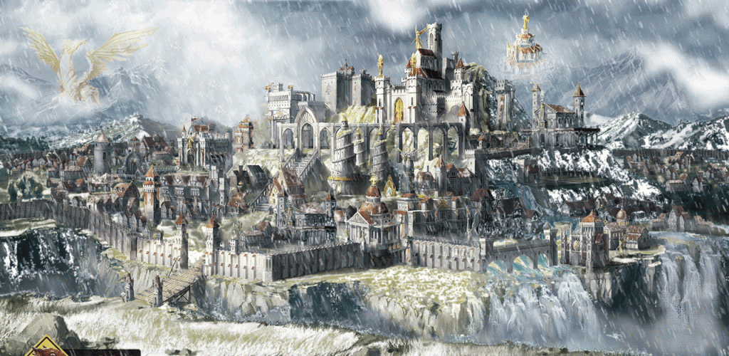
I must admit I liked Galaad's version (with or without the snowfall) better, the colours were nicer, a bit warmer, and the occasional golden accents added a bit of warmth. I feel the last version is too cold and grey, to the point of almost seeming monochromatic grey/red.
____________
What will happen now?
|
|
cleglaw

Famous Hero
|
|
posted January 12, 2015 05:30 PM |
|
Edited by cleglaw at 17:33, 12 Jan 2015.
|
@lizardwarrior
wow this is getting better and better 
really liked the frozen/snowy/cloudy theme this time, seems fixed! also i must thank you for the banishing of yellow pokemon, seems a lot more better!
and not to forget, extending walls/replacing town portal is a great thing.
the windmill on the right side(ya i ll call it windmill i mean why not?) maybe a bit smaller or bigger? just to create a difference from other one.
|
|
kiryu133

Responsible
Legendary Hero
Highly illogical
|
|
posted January 12, 2015 05:42 PM |
|
|
pretty great. as alci said, a bit cold/grey but everything else is starting too look like an actual townscreen
the ex-location for the portal being all walled of is a bit strange but whatever.
|
|
Darkem

Known Hero
|
|
posted January 12, 2015 06:18 PM |
|
|
With all do respect, but Galaad version is so far the best. If I had to be picky I would just point the broken perspective and poor execution of "Portal of Glory" (Angel dwelling). Good job, I hope Ubi will change the town screen to yours  . .
|
|
Lawmaker
Hired Hero
|
|
posted January 12, 2015 06:26 PM |
|
|
Lol Portal of Glory. Anyway lets not forget all we are doing is simply just altering, as much as our abilities enable us to, the original image. Unless we have we have only the foundations without the structures, we cannot entirely change it. And TBH it is just a "Concept art". And the final results will probably not look like this. All i just hope is that there are people from UBI who are watching these forums and taking note.
Ps. I love the statue of Elrath. That last picture looks unfinished without it.
Pss. Angel are on a scuicide run ehe?
|
|
cliff_nest

Hired Hero
|
|
posted January 12, 2015 07:03 PM |
|
|
@LizardWarrior This is definitely on the right track. I won't miss the golden sun either. That angel statue on top could do just the same for me even tough it would be similar to the academy one. The forest on the background instead of crop farm is a nice alternative and works.
The angel do fly this time? elysium position don't bother me somehow unless we can figure something better. I think the flame should be more vivid, maybe add some more or some wolf statut or symbol/flag so we start feeling this is the wolf duchy.
I don't know if it's a cavern on right under convent of elrath but it could work for a wolf/beast den. I still think that wall running to hall of heroes is unecessary.
Again great job I hope they get inspired by what u did here.
|
|
Stevie

Responsible
Undefeatable Hero
|
|
posted January 12, 2015 07:19 PM |
|
|
alcibiades said:
I must admit I liked Galaad's version (with or without the snowfall) better, the colours were nicer, a bit warmer, and the occasional golden accents added a bit of warmth. I feel the last version is too cold and grey, to the point of almost seeming monochromatic grey/red.
This.
The other one was just perfect. This one is close but not quite the same. Ridges shouldn't have snow, the vegetation near mountains usually consists of pine trees not dead leafy forests. The Elysium should definitely be flying, and maybe with a changed model to resemble more the Heroes 3 Portal of Glory. And the wall on the right side of the gate looks really bad now, forking in two directions, near the ridge and inside the town. The grail being removed makes it a lot more believable and balanced.
So in the end a good work, and nice applying of color with attention to details like snowy roofs, but I liked Galaad's better.
____________
Guide to a Great Heroes Game
The Young Traveler
|
|
Zombi_Wizzard

Famous Hero
|
|
posted January 12, 2015 07:25 PM |
|
|
Golden dragon statue is a grail. A one-of-a-kind mithological building, that only tales of it are heard, but noone had actualy seen it. It's supposed to be extremly unrealistc and big. It's the kind of thing only human immagination can produce ... kinda like El-Dorado, a huge city made of solid gold (probably bilions of tones of gold).
In world with floating islands and buildings that defy most architectural and static laws, normal sized statue seems underwhelming. A grail must be therefore extremly unrealistic, not just for our worldd, but for Ashan aswell. This is why i don't realy mind it.
|
|
LizardWarrior

Honorable
Legendary Hero
the reckoning is at hand
|
|
posted January 12, 2015 08:09 PM |
|
|
Okay, added more color, stained glasses and a subtle Elrath made of clouds, kinda like deity of fire from H3 but more subtle

|
|
Lawmaker
Hired Hero
|
|
posted January 12, 2015 08:16 PM |
|
|
My thoughts exactly. A grail structure needs to be more grandios(maybe not overly) than other structure as it commemorates the achievement of owning the most sought after artifact in Ashan(or any Homm world). A lot of the grail structures in the previous heroes didnt really strike me, as they look like just any other building(the really good ones where mostly large statues of some sort(Inferno, dungeon and Haven/castle mostly).
So making the grail structure too small or making it look like just another generic building is not the right direction to go
|
|
Valen-Teen

Famous Hero
UFOlolOgist
|
|
posted January 12, 2015 10:08 PM |
|
|
You just mock the townscreen :-/
But I like idea with snowfall
____________
Our hopes for Heroes VIII!
|
|
Storm-Giant

Responsible
Undefeatable Hero
On the Other Side!
|
|
posted January 12, 2015 10:09 PM |
|
|
I kind of like placing the Elrath huge statue in the mountains of the background, more than where is placed originally for sure. It's so creeeeepy there
____________
|
|
Darkem
Known Hero
|
|
posted January 12, 2015 10:33 PM |
|
Edited by Darkem at 22:35, 12 Jan 2015.
|
Imo, we're extremely close to overdo the townscreen. The best option has already appeared: 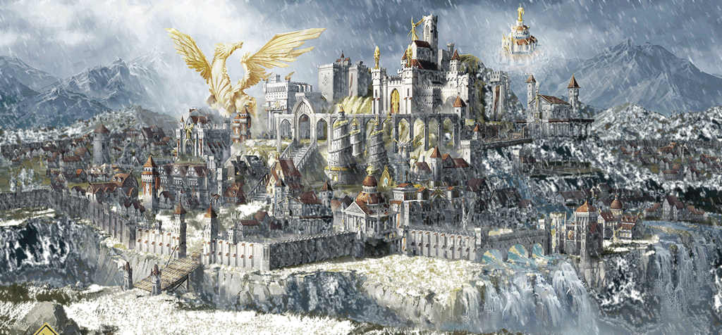
|
|
cleglaw
Famous Hero
|
|
posted January 12, 2015 11:29 PM |
|
Edited by cleglaw at 23:30, 12 Jan 2015.
|
no sir, as long as pokemon stays at same spot, my answer is no. i certainly favor last pictures over first pictures, and first pictures over original one.
sunny/cloudy thing is a choice, but other improvements are really improvements and they should not be denied.
|
|
Kimarous

Supreme Hero
|
|
posted January 13, 2015 12:53 AM |
|
|
|
Ugh, what's with everyone's aversion to colour? I'm sick and tired of the prevailing "real is brown" mentality over the past decade. Is it too much to ask for NON-muted colours? Why do people WANT muted colours? Maturity =/= BORING!
|
|
Galaad


Hero of Order
Li mort as morz, li vif as vis
|
|
posted January 13, 2015 01:10 AM |
|
|
Moved the statue, lost some layers so couldn't replicate exactly the same snowstorm. Thanks for keeping comments constructive 
____________

|
|
Stevie
Responsible
Undefeatable Hero
|
|
posted January 13, 2015 01:34 AM |
|
Edited by Stevie at 01:35, 13 Jan 2015.
|
Kimarous said:
Ugh, what's with everyone's aversion to colour? I'm sick and tired of the prevailing "real is brown" mentality over the past decade. Is it too much to ask for NON-muted colours? Why do people WANT muted colours? Maturity =/= BORING!
Excuse me but I'd like something more believable than what we've got so far. I'm not exactly imagining Trine levels of colorfulness when thinking about Heroes. The pictures overblown on brown layers/recolor are not what I envision either, and I'm sure the others also made their opinions clear on that.
The original theme, while good in itself, doesn't fit imo. Not after we've seen that snow theme from Galaad above. Couple that with the environment (mountains are just kilometers away) and the models we've seen so far clothed with partial fur and you'll get it why it feels a lot more accurate. The town feels rugged, harsh and aggressive, and that's what the word Wolf inspires. Not brightness and shininess.
____________
Guide to a Great Heroes Game
The Young Traveler
|
|
Kimarous
Supreme Hero
|
|
posted January 13, 2015 02:29 AM |
|
|
Stevie said:
Excuse me but I'd like something more believable than what we've got so far. I'm not exactly imagining Trine levels of colorfulness when thinking about Heroes. The pictures overblown on brown layers/recolor are not what I envision either, and I'm sure the others also made their opinions clear on that.
The original theme, while good in itself, doesn't fit imo. Not after we've seen that snow theme from Galaad above. Couple that with the environment (mountains are just kilometers away) and the models we've seen so far clothed with partial fur and you'll get it why it feels a lot more accurate. The town feels rugged, harsh and aggressive, and that's what the word Wolf inspires. Not brightness and shininess.
Yeah, yeah. Lot of "me" statements and what you want. I said my piece, and my opinion differs from yours. I was just stating my position; you don't need to make a counterpoint, especially when it boils down to "I personally want something more believable."
|
|
|
|

 This thread is pages long:

