|
|
Maurice


Hero of Order
Part of the furniture
|
 posted January 13, 2015 09:16 AM
 |
|
|
I still feel Galaad's version sucks.
Because we all know it won't be ingame, but instead we'll get something that looks like the original one  . .
Galaad has spoiled us  . .
|
|
Zombi_Wizzard


Famous Hero
|
 posted January 13, 2015 09:26 AM
 |
|
|
I agree with Kimarous on this one. And like i said in my previous post from all of these Ubi town screens i like summer time better.
I think this goes with the trend of: "middle ages are dark and only allowed colours are grey and brown." This is incredibly cliche and not true. Specialy coz you know ... in reality, middle ages were wery colourful. This "dark" version of middle ages have unfortunatly crept into most modern fantasy settings, including Heroes. And to me it just dosen't fit.
When i think of HoMM serie, colourfulness of Trine is exactley what I have in mind. It has always been so.
|
|
Stevie


Responsible
Undefeatable Hero
|
 posted January 13, 2015 09:27 AM
 |
|
|
|
Avirosb


Promising
Legendary Hero
No longer on vacation
|
 posted January 13, 2015 09:33 AM
 |
|
Edited by Avirosb at 09:34, 13 Jan 2015.
|
|
This duchy fluff is very interesting, but really, they should all look the same.
|
|
Galaad


Hero of Order
Li mort as morz, li vif as vis
|
 posted January 13, 2015 09:59 AM
 |
|
|
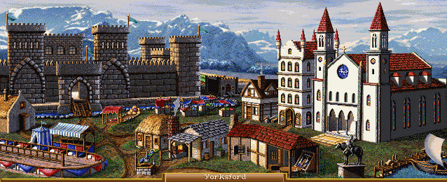
Damn you people 
____________

|
|
Galaad


Hero of Order
Li mort as morz, li vif as vis
|
 posted January 13, 2015 10:38 AM
 |
|
|
____________

|
|
Maurice


Hero of Order
Part of the furniture
|
 posted January 13, 2015 10:44 AM
 |
|
|
Zombi_Wizzard said:
I think this goes with the trend of: "middle ages are dark and only allowed colours are grey and brown." This is incredibly cliche and not true. Specialy coz you know ... in reality, middle ages were wery colourful.
Yeah, color has existed in all ages, except for a large portion of the 20th century, where everything was black and white. This only changed with the invention of color TV.

Stevie said:
Too many "me"s, Maurice. You're supposed to provide arguments on what's objectively pleasing to the eyes. 
Maurice said:
I still feel Galaad's version sucks.
Because we all know it won't be ingame, but instead we'll get something that looks like the original one  . .
Galaad has spoiled us  . .
Total "me" count: 0. Unless I count the "I", then it's 1.

Galaad said:

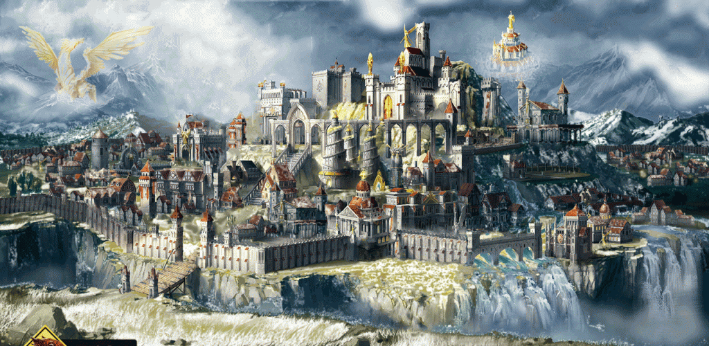
It looks great, like the previous ones  . Too bad the source material you have to work with is so ... sub-par . Too bad the source material you have to work with is so ... sub-par  . .
|
|
alcibiades


Honorable
Undefeatable Hero
of Gold Dragons
|
 posted January 13, 2015 11:19 AM
 |
|
|
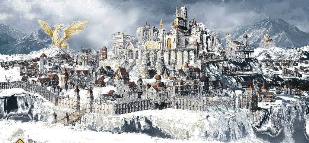
I like the idea of moving the statue, although I would go with the hill slightly closer to town, the one under the right wing and in between the new and old position. I think there's too little snow on the ground in the last version also, I like the one back from page 18 better. Even more civilian buildings is another step forward, however, the one above actually looks like a town.
Edit> Here's a crude example of what I mean. Also moved the Transept closer to town and made it a bit smaller, because the position in above images makes no sense with regard to size and perspective.
____________
What will happen now?
|
|
Gryphs


Supreme Hero
The Clever Title
|
 posted January 13, 2015 11:37 AM
 |
|
|
Zombi_Wizzard said:
Specialy coz you know ... in reality, middle ages were wery colourful.
I would not call it very colorful time if we are talking about buildings that is as most were made out of wood and stone the grey and brown colors are inevitable.
|
|
kiryu133


Responsible
Legendary Hero
Highly illogical
|
 posted January 13, 2015 11:57 AM
 |
|
Edited by kiryu133 at 11:59, 13 Jan 2015.
|
final one gets colour and lightning right (though once again, the source lightning does still kinda mess things up) and it looks great. not really sure what to think of the statue. golden human statue would probably look better and not so... imposing.
-not about the fan-screens anymore-
when it comes to colours i think h3/4 are a good indicator for what i want in different ways. h3 is more realistic with weak yet deep colours. h4 went full rainbow-colours everywhere and conveyed more of a fairy tale feel. guess it depends on what you want, but just making things grey or brown isn't realistic or even believable. it's just dull.
look at the h3 haven screen.

there are strong and deep colours like the blue tent and golden insignias but there are also several kinda toned down greens and blues and browns along with some light-grey military structures and white clouds. there are many different shades and colours at play here and no one takes precedent over the other like red does in the h7 haven screen. in fact, i'd go as far as saying the colours are too strong and monotone. there are only like three colours: red, white and green. sure, there is some gold detailing (and that giant statue) but you don't notice that since the reds and whites take so much attention.
tl;dr: there are too few, strong colours in h7 screens. add more and tone them down.
|
|
Galaad


Hero of Order
Li mort as morz, li vif as vis
|
 posted January 13, 2015 12:08 PM
 |
|
Edited by Galaad at 12:11, 13 Jan 2015.
|
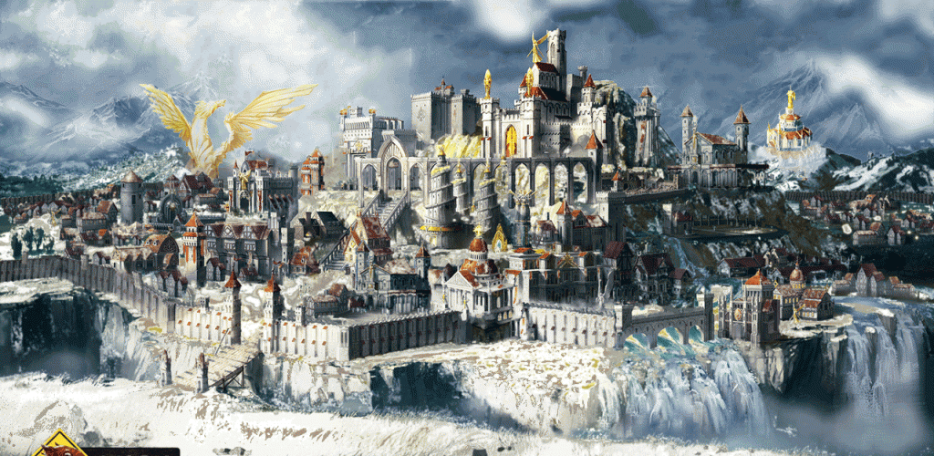
I prefer Alci's version of Elrath, but now that I've cut his butt, of course I didn't save the separate layer.. have to leave for now, keep commenting I will try to improve more 
____________

|
|
Avirosb


Promising
Legendary Hero
No longer on vacation
|
 posted January 13, 2015 12:13 PM
 |
|
|
|
Galaad, can you turn the staircase into an elevator?
|
|
dark-whisperer


Famous Hero
Darkness feels no mercy
|
 posted January 13, 2015 12:25 PM
 |
|
|
Here is MY opinion.
Showy townscreen works only at snowy terrain and looks totally out of place anywhere else. I cant really imagine it on desert, lava or even grass. We don't know how towns will look like on the adventure map but unless they have snowstorm always above them I cant justify presence of heavy layer of snow.
Other thing is that it looks depressing. I get that wolf duchy has dark vibe, but this looks like village of the damned in Transilvania (mostly those with colors toned down).
|
|
alcibiades


Honorable
Undefeatable Hero
of Gold Dragons
|
 posted January 13, 2015 12:40 PM
 |
|
|
dark-whisperer said:
Snowy townscreen works only at snowy terrain and looks totally out of place anywhere else.(...)

...
____________
What will happen now?
|
|
Avirosb


Promising
Legendary Hero
No longer on vacation
|
 posted January 13, 2015 12:44 PM
 |
|
|
dark-whisperer said:
Other thing is that it looks depressing.
Well yeah, some things are just impossible to change.
|
|
dark-whisperer


Famous Hero
Darkness feels no mercy
|
 posted January 13, 2015 12:48 PM
 |
|
|
@alcibiades
Yes, for me, that looks out of place too.

But on the town screen there is no snowfall, roofs are not covered in layer of snow, sky is much clearer, even river is bright blue and overall there is more color. Its not as immersion breaking as altered ones. Again its just my opinion.
|
|
Avirosb


Promising
Legendary Hero
No longer on vacation
|
 posted January 13, 2015 12:57 PM
 |
|
|
 Disgusting Disgusting 
|
|
dark-whisperer


Famous Hero
Darkness feels no mercy
|
 posted January 13, 2015 01:07 PM
 |
|
|
Avirosb said:
Disgusting 
I agree. I hate half melted snow too 
|
|
Maurice


Hero of Order
Part of the furniture
|
 posted January 13, 2015 01:25 PM
 |
|
|
dark-whisperer said:
Here is MY opinion.
Showy townscreen works only at snowy terrain and looks totally out of place anywhere else. I cant really imagine it on desert, lava or even grass. We don't know how towns will look like on the adventure map but unless they have snowstorm always above them I cant justify presence of heavy layer of snow.
That's why they should implement different looks, like they did with Heroes 4. The terrain type on which a town is standing should reflect the look of the town. This simply means they have to make the general concept of a town and then create a few varieties.
I don't think it'll happen this game, but hopefully that's something for the next installment in the series.
|
|
TDL


Honorable
Supreme Hero
The weak suffer. I endure.
|
 posted January 13, 2015 01:28 PM
 |
|
|
If the game is indeed as moddable as they say it will be, then I'd suggest leaving these features be and allow crafty fans to do what they like with them. There are just so many features I believe Skyrim's/Oblivion's devs could have added, but it just was more worth it to leave it to the fans 
____________
|
|
|
|


