|
|
JollyJoker


Honorable
Undefeatable Hero
|
 posted April 07, 2017 04:46 PM
 |
|
|
My stance on it is that H1 and especially H2 (being basically the same game except expanded a lot) had EXACTLY the right art style for this game specifically and this kind of game in general.
With the way stack-based combat works, the word "realism" has absolutely no place whatsoever there. (I have no problem using the word "realism" with Age of Wonders or Disciples with their single-entity combat.)
Which was the beauty of the starting titles: Completely fairy-tale-ish, beer-and-pretzel-like, fast - but with a deep enough "game engine" to allow guys who like a tactical (and strategic) challenge enough to mull over and burn a lot of time.
HoMM 3 took things up a notch - again "in stride", because for one thing the game got more involved from a tactical and strategical or GAMING point of view, and this was reflected via the graphics by making things less fairy-talish and more "grown-up". The style is still cartoonish, but goes up from storybook for children to, say, Prince Valiant.
H3 - imo - is still not "realistic". You are still in a storybook world, playing storybook characters. These games seem always to give you the blink  , instead of trying to "sell" an "epic" fantasy universe of GoT proportions. , instead of trying to "sell" an "epic" fantasy universe of GoT proportions.
In this regard H6 and H7 suck, and totally so. H5 is something of a hybrid. They were still quite "disorganized", concentrating on the transition to 3d instead of the creation of a fantasy universe. With H5 it was "just" a new setting that could have gone every which way.
|
|
Bitula


Known Hero
|
 posted April 07, 2017 05:28 PM
 |
|
|
I was only talking about the Art/Graphics, not gameplay, story, settings or overall impressions.
From Wiki see bold:
Realism in the arts is the attempt to represent subject matter truthfully, without artificiality and avoiding artistic conventions, implausible, exotic and supernatural elements.
Realism has been prevalent in the arts at many periods, and is in large part a matter of technique and training, and the avoidance of stylization.
H5-H7 are closer to this than H1-H3. Furthermore, I think H6 and H7 has graphically more detailed, elaborated creatures, created with more advanced technique then H5. I see no other significant difference between the three of them. H7 is somewhat closer to H5 in art style than H6.
|
|
LizardWarrior


Honorable
Legendary Hero
the reckoning is at hand
|
 posted April 07, 2017 05:30 PM
 |
|
|
You compare graphics of a game made 20 years ago, of course h7 is gonna look more real  But as a 2016 game, h7 doesn't even use PBR. But as a 2016 game, h7 doesn't even use PBR.
____________
|
|
Galaad


Hero of Order
Li mort as morz, li vif as vis
|
 posted April 07, 2017 05:35 PM
 |
|
|
Bitula said:
Yes, for example look at the red girl left to "backto school". Looks like the hobbit near the mage (artistically).
Bitula said:
H7 is somewhat closer to H5 in art style than H6.

____________

|
|
Bitula


Known Hero
|
 posted April 07, 2017 05:43 PM
 |
|
|
LizardWarrior said:
You compare graphics of a game made 20 years ago, of course h7 is gonna look more real  But as a 2016 game, h7 doesn't even use PBR. But as a 2016 game, h7 doesn't even use PBR.
You can do stylization in 3D too. The fact that H7 is not over-stylized, is not anime or any other art intentionally departing from realism is positive for those who like realism. Same for H5 and H6. Really no difference here (H5-H7). All of them are somewhat cartoonish but not to a level like anime, which I would never purchase even if it is an exceptionally good game otherwise.
|
|
verriker


Honorable
Legendary Hero
We don't need another 'eroes
|
 posted April 07, 2017 05:44 PM
 |
|
|
I'm in the middle of sculpting a very Realistic erwin statue but actually ran out of butter for my task,
mate do any of you know where is the butter shop nearby and who sells the cheapest butter, I need my butter to sculpt and also to butter my toast to keep my energy bar high for my artiste craft cheers lol
____________

|
|
JollyJoker


Honorable
Undefeatable Hero
|
 posted April 07, 2017 06:47 PM
 |
|
|
Bitula said:
I was only talking about the Art/Graphics, not gameplay, story, settings or overall impressions.
From Wiki see bold:
Realism in the arts is the attempt to represent subject matter truthfully, without artificiality and avoiding artistic conventions, implausible, exotic and supernatural elements.
Realism has been prevalent in the arts at many periods, and is in large part a matter of technique and training, and the avoidance of stylization.
H5-H7 are closer to this than H1-H3. Furthermore, I think H6 and H7 has graphically more detailed, elaborated creatures, created with more advanced technique then H5. I see no other significant difference between the three of them. H7 is somewhat closer to H5 in art style than H6.
I know what you are talking about - but, and this isn't meant as a personal rebuke or something, "realism in art style" makes no sense, when the subject is a PLACEHOLDER, because that's what it is. In H5-7 the battkefield looks like "monster chess" - although the CONTEXT speaks of a battle with dozens and hundreds and even thousands of participants.
In other words, the BATTLEFIELAD AS SUCH is STYLIZATION, no matter how "realistic" the chess pieces come along. Which means, the realism is utterly wasted, since everything else is stylized.
That's completely different in, say, Disciples. Disciples is a whole universe above H6-7 when it comes to style, realism, art direction, grown-up setting and so on, but that's also in keeping with the what the gameplay offers.
Which I, and a couple others here, find extremely important: art style and direction should reflect the game as a whole. When you play stuff like Total War you don't want comic art, but somewhat "realistic/historical" art.
|
|
Gryphs


Supreme Hero
The Clever Title
|
 posted April 07, 2017 07:40 PM
 |
|
|
Bitula said:
You can do stylization in 3D too. The fact that H7 is not over-stylized, is not anime or any other art intentionally departing from realism is positive for those who like realism. Same for H5 and H6. Really no difference here (H5-H7). All of them are somewhat cartoonish but not to a level like anime, which I would never purchase even if it is an exceptionally good game otherwise.
None of the upgrades are even remotely "realistic", they all look like they are in a perpetual parade. To be quite honest I think quite a few of the units would not look out of place in an eye candy filled anime at all. In an anime with more realistic designs, though, H7's units would look out of place to the surprise of no one.
____________
"Don't resist the force. Redirect it. Water over rock."-blizzardboy
|
|
Bitula


Known Hero
|
 posted April 07, 2017 07:41 PM
 |
|
|
|
Well certainly H1-H7 series are not the best platform for realism (can’t compare to eg.: Skyrim) but still discussing which iteration is more realistic makes sense. Realistic art is most applicable for the individual creatures (2D/3D models) and not concepts like battlefield. Sure, battlefield is stylization. I was referring to the individual figures (creatures). H3 towns are realistic and of a good quality. They are actually more realistic than H5. If battlefield figures would’ve been similar in style as the towns, I wouldn’t complain. H3 towns have a style, whereas the battlefield figures are an assortment of “clowns” and they look cheap. H5 towns and creatures are much more in synch and creatures look well designed.
|
|
Bitula


Known Hero
|
 posted April 07, 2017 07:53 PM
 |
|
|
Gryphs said:
None of the upgrades are even remotely "realistic", they all look like they are in a perpetual parade. To be quite honest I think quite a few of the units would not look out of place in an eye candy filled anime at all. In an anime with more realistic designs, though, H7's units would look out of place to the surprise of no one.
I don’t think that you can make an anime more or less realistic. This doesn’t make any sense. Upgrades are just cheap recoloring of base creatures AFAIR. Well yes, the cheap over-coloring of creatures does not add to realism, but it is not a significant factor. I mean if you wear a colorful shirt, you would still be realistic.
|
|
Gryphs


Supreme Hero
The Clever Title
|
 posted April 07, 2017 07:56 PM
 |
|
|
I really do not see how H3's units are out of sync, they all shared a general theme and colour palette. Of course they looked less impressive they were pixels. What is "clownish" about them?
____________
"Don't resist the force. Redirect it. Water over rock."-blizzardboy
|
|
verriker


Honorable
Legendary Hero
We don't need another 'eroes
|
 posted April 07, 2017 08:18 PM
 |
|
Edited by verriker at 20:18, 07 Apr 2017.
|
btw bear in mind Heroes 3 actually had the most realistic looking creatures in the series cheers lol
   
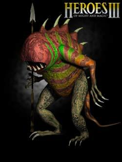 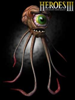 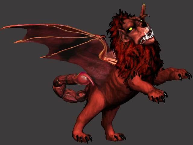 
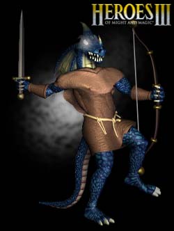  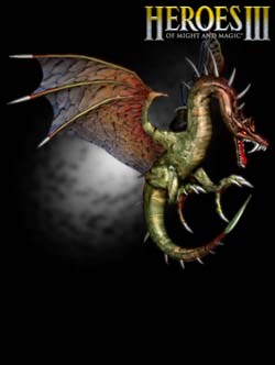 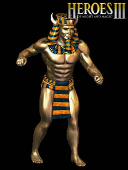
____________

|
|
Gryphs


Supreme Hero
The Clever Title
|
 posted April 07, 2017 08:23 PM
 |
|
|
Bitula said:
I don’t think that you can make an anime more or less realistic. This doesn’t make any sense. Upgrades are just cheap recoloring of base creatures AFAIR. Well yes, the cheap over-coloring of creatures does not add to realism, but it is not a significant factor. I mean if you wear a colorful shirt, you would still be realistic.
Wot? What does realistic mean to you exactly?
____________
"Don't resist the force. Redirect it. Water over rock."-blizzardboy
|
|
JollyJoker


Honorable
Undefeatable Hero
|
 posted April 07, 2017 08:38 PM
 |
|
|
Bitula said:
Well certainly H1-H7 series are not the best platform for realism (can’t compare to eg.: Skyrim) but still discussing which iteration is more realistic makes sense. Realistic art is most applicable for the individual creatures (2D/3D models) and not concepts like battlefield. Sure, battlefield is stylization. I was referring to the individual figures (creatures). H3 towns are realistic and of a good quality. They are actually more realistic than H5. If battlefield figures would’ve been similar in style as the towns, I wouldn’t complain. H3 towns have a style, whereas the battlefield figures are an assortment of “clowns” and they look cheap. H5 towns and creatures are much more in synch and creatures look well designed.
But the question is, why "more realiatic" would equal better. In case of HoMM it's at least debatable.
I mean, take Donald Duck - Duckville and everything connected with it. It's a comic. Would it be a better comic when Donald Duck would look like a "realistic" Duck in sailor jacket and cap? I seriously doubt that.
Which is what HoMM did - establishing a consistent style for a game that was a great fit.
The serious crap of H6-7 is wasted on the game because the game doesn't feel serious or realistic. I mean, take H5 Dungeon. Do it a tad more cartoony and it actually works. It's FUNNY, for frag's sake. The serious game behind that notwithstanding. Or H6 Sanctuary. The Kappas are cool. But they would be cooler as "frogs" and "frog princes" as an upgrade, if you get my drift, instead of a silly "realistic" take on them. Or H7. Tnis swordmaster guy or how it's called. The Haven Champion. REALISTIC? You gotta be kidding me. But make it more cartoony in a superhero kind of way, and it may be funny.
But in fact, from a REALISTIC point of view, H6 and H7 are crap, because nothing is really believable.
|
|
Selpen


Adventuring Hero
|
 posted April 07, 2017 09:10 PM
 |
|
|
verriker said:
btw bear in mind Heroes 3 actually had the most realistic looking creatures in the series cheers lol
Imho H4 was the best
|
|
verriker


Honorable
Legendary Hero
We don't need another 'eroes
|
 posted April 07, 2017 09:36 PM
 |
|
|
Selpen said:
Imho H4 was the best
for my share I think Heroes 4 dramatically improved the heroes and the adventure map in terms of realism (actually if you ever saw the HQ hero portraits of George Almond you really should, they are gorgeous, really richly detailed and easily best in the series) but the creatures and the towns were a noticeable step down, they have much simpler models and simpler textures which look hideous up close and lack character lol
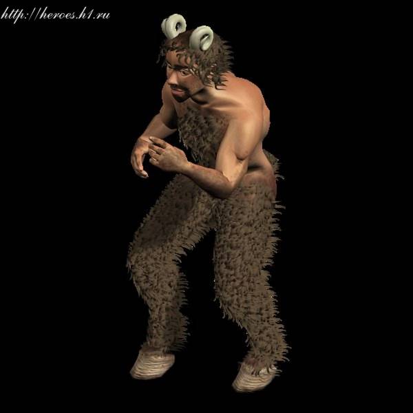
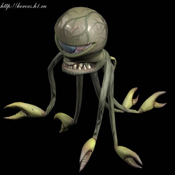

that is because Heroes 4 was rushed and also lost some key artists of Heroes 3 lol
____________

|
|
PandaTar


Responsible
Legendary Hero
Celestial Heavens Mascot
|
 posted April 07, 2017 09:40 PM
 |
|
Edited by PandaTar at 21:41, 07 Apr 2017.
|
H4 was the Heroes I most played. But it was the one I thought was the ugliest ever regarding almost every visual aspect but the adventure map.
____________
"Okay. Look. We both said a lot of things that you're going to regret. But I think we can put our differences behind us. For science. You monster."
GlaDOS – Portal 2
|
|
Sligneris


Supreme Hero
|
 posted April 09, 2017 07:12 AM
 |
|
|
|
So one question about the Trial by Fire expansion - where does Ergal appear in it? One of the new scenarios I assume?
|
|
Zeki


Supreme Hero
sup
|
 posted April 10, 2017 03:31 PM
 |
|
|
@Bitula
Wow just... wow...
Quote:
the graphics of H3 is childish [..] I mean not drawn FOR children, but BY children
That is jsut plain wrong. Those are 3d models rendered into 2d, if there is any child out there being able to do that it must be some kind of prodigy child.
Quote:
it is like from a “child’s imagination” + the quality is like drawn by a child or overly artistic, like Picasso’s works
While there clearly is abit of "child's imagination" in h3's style i don'T see anything wrong with this, as this is a game about fairytail and mythology creatures, it's kinda like saying you don't like water (as a product) because it's wet. Because that'S what it'S supposed to be. H3's style doesn'T have anything to do with picasso's work though, it's actually the most realistic heroes game in existence. H5 might be more fitting of being "picasso like" in the broadest sense as proportions are completely snowed up by going for a Warcraft like cartoonisch look.
Quote:
avoiding artistic conventions [...] avoidance of stylization
Isn't this exactly what H5 to H7 are doing though? H5 uses as mentioned the warcrafty comic style and H6 and 7 use the over the top decorative standart high fantasy art with h6 throwing in some spikes everywhere.
Quote:
The fact that H7 is not over-stylized, is not anime or any other art intentionally departing from realism is positive for those who like realism. Same for H5 and H6. Really no difference here (H5-H7).
I was just about to agree with you that h7 might come second to h3 in terms of being realistic in some form and then you come around saying h5 - h7 looks all the same... Have you visited the eye doctor lately?
Quote:
H3 towns have a style, whereas the battlefield figures are an assortment of “clowns” and they look cheap. H5 towns and creatures are much more in synch and creatures look well designed.
What you call an assortment of "clowns" is what the heroes series used to be about, having a wide array of magical and mystical creatures enabling you to create all kinds of fantasy stories. You know, with the map editor, the thing you need to study computer sciences nowadays to properly use them... Also, i like being able to tell apart creatures without at a glance wothout having to zoom in every battle.
Quote:
I don’t think that you can make an anime more or less realistic.
Now that is just plain wrong and quite ignorant, too. At this point i'd like to know what you mean with anime? Do you mean the form of media that are japanese animated series? If yes, than how can you compare 3d videogame creatures with 2d drawn shows? Now that doesnt make any sense. Also saying there are no more and less realistic animes... leaves me speechles tbh. Of course there are different styles in anime being more or less realistic. To use your words:
Well certainly animes are not the best platform for realism but still discussing which iteration is more realistic makes sense. If on the other side you mean korean flashy fantasy video game style it would make more sense comparing that to heroes creature designs but still the newer heroes games come closer to that than the old ones.
I hope i make more or less sense as i'm in a bit of a hurry, if not just ask, maybe i understood you wrong, too.
____________

|
|
Sligneris


Supreme Hero
|
 posted April 10, 2017 04:28 PM
 |
|
|
Zeki said:
What you call an assortment of "clowns" is what the heroes series used to be about, having a wide array of magical and mystical creatures enabling you to create all kinds of fantasy stories.
Now, related to that was one of the complaints I never not understood - some people saying that creatures are styled for Ashan, the universe the game is set on, like it's a bad thing.
Having the creatures look like they're supposed to look within the universe is not some anomaly - it's how anyone would expect it actually. Artistic designs should be consistent with the world they're supposed to represent. Let the world look like it's actually supposed to, as opposed to offering us some weird surprises. Nothing seemed as dumb to me as H3's Inferno faction being pretty much an archetypic tribal-slash-medieval style hell filled with demons, only to then be told it's actually a species of spacefaring aliens. What am I supposed to say to that other than "okay, whatever you say"?
I did hear that this was mostly useful for fan content, but to then complain that the game's style doesn't bend to fanfictions anymore, once developers strive to make their own world look somewhat consistent... it actually seems fairly irrational to me.
|
| |
|
|


