|
|
Salamandre


Admirable
Omnipresent Hero
Wog refugee
|
 posted March 06, 2014 11:35 AM
 |
|
|
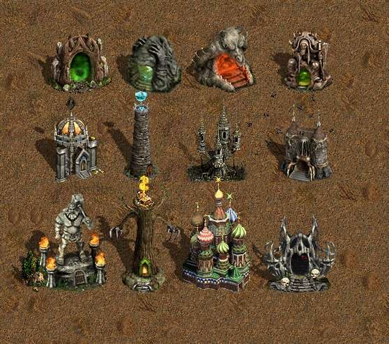
Link updated on front page with resized death chamber + all the others until now, even those not utilized.:
____________
Era II mods and utilities
|
|
fred79

Disgraceful
Undefeatable Hero
|
|
posted March 06, 2014 11:38 AM |
|
|
not sure what you're saying, artu.
@ sal: what do you think? slightly raised platform, or no?
|
|
Salamandre
Admirable
Omnipresent Hero
Wog refugee
|
|
posted March 06, 2014 11:40 AM |
|
|
Without seeing the animation, can't see why this is extra work. if it was me, I would have the dark middle frame as layer, add animations over it, and be able to move it around (with all the animations) in one click (select all similar layers + move). But if you did it differently so have to redo all work, forget...
____________
Era II mods and utilities
|
|
artu

Promising
Undefeatable Hero
My BS sensor is tingling again
|
|
posted March 06, 2014 11:49 AM |
|
|
|
I'm saying can we see your new version with the bright light in the middle instead of the black hole. Dark stones and bright light creates a good contrast while the new version looks a little pale.
|
|
fred79
Disgraceful
Undefeatable Hero
|
|
posted March 06, 2014 11:50 AM |
|
|
@ sal:
that's the thing, i can't move it all around, because of the nature of this animation. it only pans from right to left, if i moved it all around, it wouldn't look like space, it would look like a retarded mess of pixels against a black background. i could make different layers for where the space goes, but i don't see the point. the pulling point of whatever is summoned, should be static.
and, it doesn't matter if i already did the animation work, really. like i said, i don't like the clear-cut way the summoning point is now, i think it would look better with either:
more extravagant shadows around the summoning point, to get rid of the gay-ass oval visual, or
to add a platform(not a plain one, i'm thinking one with runes or something), maybe 3 or 4 pixels high.
i will do the expanded shadow idea first, post that, and see where we need to go from there. i think it'll definitely be an improvement over the current oval.
btw, how are the stones? good? too dark? should they be made of pudding? 
|
|
Salamandre
Admirable
Omnipresent Hero
Wog refugee
|
|
posted March 06, 2014 12:01 PM |
|
|
Can you upload the psd file, please? My first animations were sacrificed because bad layers handle.
____________
Era II mods and utilities
|
|
fred79
Disgraceful
Undefeatable Hero
|
|
posted March 06, 2014 12:08 PM |
|
Edited by fred79 at 12:10, 06 Mar 2014.
|
the current animated space frames? they're not complete, they are missing the stones layer, and the shadows. i could post them anyway, but it'd be a waste of time, as they aren't complete, and you wouldn't be able to see the full graphic for proper judgement.
here is what the improved "oval" looks like.

is it good enough, or do we still need a platform? i'm thinking we may need a platform, but where are we going to find one the right size, shape, etc.?
as for the space graphic itself, i'm going to make a layer for it, just like the animated ocean water(the good version), that someone made(grayface, i think).
|
|
Salamandre
Admirable
Omnipresent Hero
Wog refugee
|
|
posted March 06, 2014 12:10 PM |
|
|
|
fred79
Disgraceful
Undefeatable Hero
|
|
posted March 06, 2014 12:16 PM |
|
|
in that case, i'll post the unfinished graphic that contains the space only, as i already have that done, just need to compile a gif.
any more of this, and i'll run out of posting ability. i think we should do idea-mulling over the hcm, gentlemen, and leave the posting to screenshots/visual advancements. 
|
|
artu
Promising
Undefeatable Hero
My BS sensor is tingling again
|
|
posted March 06, 2014 12:19 PM |
|
|
|
Well, since you're the one doing the work, I say a mod can give you just one more QP and you'd get rid of that post limit. It is better to post ideas in public where everybody sees everybody's input and improve on it.
|
|
fred79
Disgraceful
Undefeatable Hero
|
|
posted March 06, 2014 12:24 PM |
|
Edited by fred79 at 12:49, 06 Mar 2014.
|
that's not going to happen, and it shouldn't, anyway.
here is the unfinished, but animated, graphic. hopefully, you don't have to pull out the bino's:

i'm going to post a gif showing only every other frame, to see if i can help it to flow better. i like the creeping it's doing now, but it looks a little jerky.
nope, it looks more jerky, spaced further apart:

oh well. even if i don't use the space animation for this def, i'll use it for other things i have planned.
lol, the first one is kinda hypnotizing... but i AM tired.
|
|
Salamandre
Admirable
Omnipresent Hero
Wog refugee
|
|
posted March 06, 2014 12:52 PM |
|
|
This is very nice idea. But imo:
a) is suitable for bigger areas, 2-3 stars are barely visible.
b) Stars should have at least 3-4 different colors, red yellow...did I say would be better on bigger area?
c) Do it anyway if you can, so we see how the whole looks then eventually come with a better arrangement based on this idea.
d) For such thing 10 frames are more than enough (remember that you can combine layers to have multiple stars at once in same)
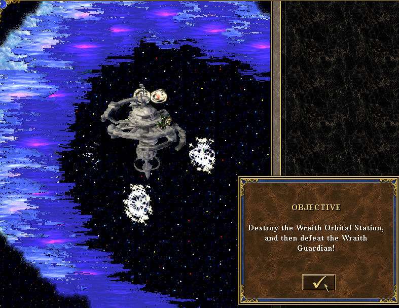
e) recalls me my Atlantis orbital station
____________
Era II mods and utilities
|
|
fred79
Disgraceful
Undefeatable Hero
|
|
posted March 06, 2014 01:58 PM |
|
Edited by fred79 at 16:15, 06 Mar 2014.
|
what do you think about this size for the base of the space layer, sal?

i was in the middle of animating one solid 256x192 frame, when i realized that it would be more complicated to use those frames to animate any object i want with space, when i could just use the long pic, and cut half of the steps out.
------------------
this is what it looks like, 1st frame:

i'm good with the size now, and i'll probably add something around the edges of the circle, but i'm not sure about the stones anymore. the stones on the far side of the circle look like junk. i may have to redo the stone layer, and choose a different texture altogether.
------------------
i want to replace the stone layer entirely. i opt for a platform that the space'll "sit" on. maybe with a stone to the left and one to the right(it'll open up the viewable animation, as well). i'll look for something workable. hell, i could just make one manually. wouldn't be that hard at all. but i gotta choose the right stone texture.
------------------
here is another version(constantly updating with improvements, so sorry for bumping so much):

improvements? ideas?
____________
|
|
Salamandre
Admirable
Omnipresent Hero
Wog refugee
|
|
posted March 06, 2014 05:07 PM |
|
|
If you are going to animate the bottom, it will suggest more of a "mirror of the way home" than summoning stones. Anyway, go ahead and finish it, looks good. Still, I would levitate the bottom.
____________
Era II mods and utilities
|
|
artu
Promising
Undefeatable Hero
My BS sensor is tingling again
|
|
posted March 06, 2014 06:04 PM |
|
Edited by artu at 18:08, 06 Mar 2014.
|
This is better than the modified original.
I think the original works with the bright center, for dark center, you need something framed like this, otherwise it looks weird.
Btw, is there anybody besides the three of us, that gives a **** about this?
|
|
Salamandre
Admirable
Omnipresent Hero
Wog refugee
|
|
posted March 06, 2014 06:46 PM |
|
|
Oh, I am already happy with you two. Imagine alone and with 3 consecutive posts limit, how could I?
We already lost Fred with his 20 posts limit. Get more shinies, you noob so we can flood for ever.
____________
Era II mods and utilities
|
|
fred79
Disgraceful
Undefeatable Hero
|
|
posted March 07, 2014 12:13 AM |
|
Edited by fred79 at 12:42, 07 Mar 2014.
|
Salamandre said:
Oh, I am already happy with you two. Imagine alone and with 3 consecutive posts limit, how could I?
We already lost Fred with his 20 posts limit. Get more shinies, you noob so we can flood for ever.
lol.
i'll try levitating the bottom without screwing the graphic. i think the problem will be, it'll just look like it's higher up on the map, but still on the ground. the cover of darkness has the smoke coming up, and it STILL looks like it just sits higher on the ground, and not in the air. i never did like that animation. i liked the twinkling stars, though, but the rest didn't give me the idea of floating at all. besides that, if whatever is summoned comes from the space "portal", what's it gonna do, have to jump down to the ground? if it was floating, it would make more sense to have the space set up more as a door, in a vertical manner. but then, it would look too much like the mirror of the homeway.
i'm trying to do something more unique with this graphic, which is why i got rid of the old stones, because they resembled graphics that were already in the game. i think the newest version is good, just a little plain. i will see what i can do to it(i'll still try the hovering space, sal, but the cover of darkness sure doesn't convince me that it'll look like it's off the ground. maybe i can find a way to make it appear more so.)
i'll keep working on this, and continue posting in this post, since it will be my 20th. lol. noob.
-----------------
ok sal, here is a new version with the space hovering:

i thought about adding the "smoke" graphic from the cover of darkness, directly under the space opening, but i don't know if the animation will flow, and i'll have to repeat that for 96 frames.
and, a new version with the space opening in a platform:

i used a different stone texture for the tri-stone graphic. it doesn't look so plain anymore, i don't think. but i have considered making glowing runes around the rim of the base, for extra pizzazz.
----
i've decided i like the platform graphic better. the arrangement is better, and the space is more defined. it doesn't resemble any other graphic currently in HoMM3 that i can think of. plus, i like this stone texture better. now, i will try the runes, and see if that makes it better, or worse. i will use the obelisk rune style(not the same runes, but the manner in which the runes are made). i need to sharpen some of the stone, as well.
---------
this will be the final version. i sharpened the stone, and added another piece to the base. the runes didn't look right, so i'm not using them.

---------
here is a gif of the new object, fully animated:

(flawed def removed)
|
|
Salamandre
Admirable
Omnipresent Hero
Wog refugee
|
|
posted March 07, 2014 11:54 AM |
|
|
It wasn't a joke, you really used 96 frames 
Very good looking object, keep the frames as you will need to lower it a bit-in def tool- if give any functionality. Also it can be much bigger, now is one square only?
Please upload the msg/msk, I can't test it without.
|
|
fred79
Disgraceful
Undefeatable Hero
|
|
posted March 07, 2014 12:41 PM |
|
|
why would i lie, or exaggerate?
not sure how it is only one square, you're losing me. it's 3 across. i took a look at the def again, not sure why it is above the position it should be in, i thought it was in the same spot as the old. i'm uploading the fixes for the def, .msg, and .msk here:
def
msg
msk
|
|
Salamandre
Admirable
Omnipresent Hero
Wog refugee
|
|
posted March 07, 2014 01:03 PM |
|
|
3 download links? Have you heard of rar compression? Why not 96 download links, one for each frame?
The def name is invalid, there are limits to strings, must not exceed 12. So I had to rename all three.
Looks very nice, but the animation is way too slow, that's why I told 96 frames is exaggerated. Test it, maybe you like it that way.
|
| |
|
|

 This thread is pages long:

