|
|
fred79

      
Disgraceful
Undefeatable Hero
|
 posted March 04, 2014 02:48 AM
 |
|
|
|
sure, that's fine. the school of wizadry object you posted there is much nicer than the old i posted as a replacement. i don't care for the new skull, though.
|
|
Salamandre


Admirable
Omnipresent Hero
Wog refugee
|
 posted March 04, 2014 02:49 AM
 |
|
|
A pity, I keep all versions of every object I work on in a specific folder, so later I can reverse if result not good. I never work on 8 bit, this is done only when I convert for def.
____________
Era II mods and utilities
|
|
fred79

      
Disgraceful
Undefeatable Hero
|
 posted March 04, 2014 02:55 AM
 |
|
|
|
i don't work on 8-bit either, i always convert graphics from Index to RGB color, i have to, in order to work on them. i've done this for a multitude of objects that i pulled from defs, and you don't see anything wrong with them, do you? just saying, they're going to convert to 8-bit anyway, when you add them...
|
|
Salamandre


Admirable
Omnipresent Hero
Wog refugee
|
 posted March 04, 2014 03:24 AM
 |
|
|
I know, I mean is a pity that you only have defs to upload, so I can't use your material. I would need the original real size. Your tavern has nice contrast, can you achieve same effect for the home of the bat I uploaded on previous page HERE?
____________
Era II mods and utilities
|
|
fred79

      
Disgraceful
Undefeatable Hero
|
 posted March 04, 2014 04:31 AM
 |
|
Edited by fred79 at 04:32, 04 Mar 2014.
|
yeah, i don't see why not. this time, i'll keep the original size+formula for HoMM3-ing it handy, so you can use it.
question, though: why do you need the original sizes to work with? i mean, you could shrink the bats as a seperate graphic if they're big too, and then add them to the smaller "home of the bat" dwelling. do you have only one formula you work with?
|
|
Salamandre


Admirable
Omnipresent Hero
Wog refugee
|
 posted March 04, 2014 04:43 AM
 |
|
|
If original size, is more healthy when you cut/paste things. For example I needed to resize tavern's windows, so had to work with original, as def had windows of 3 pixels.
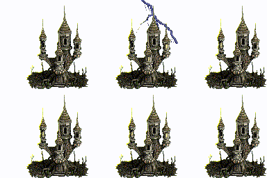
Here is my Transylvania tavern concept. Untranslatable in gif, there are endless possibilities to combine those frames (actually only 18 frames). In map the lightning looks very soft, in gif looks aggressive.


____________
Era II mods and utilities
|
|
fred79

      
Disgraceful
Undefeatable Hero
|
 posted March 04, 2014 05:20 AM
 |
|
Edited by fred79 at 05:26, 04 Mar 2014.
|
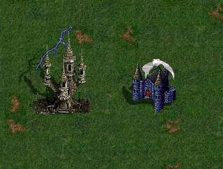
damn, that's cool. but: the object will probably only be good for darker terrains, with the lightning. maybe not so much with rough(possibly), underground, snow, or sand. the gif image shows you how it'll tend to look on those terrains.
also, if you're going to keep the lightning, you should have a cloud that the lightning comes from(and is overtop of). i was thinking this cloud. those download links are dead, but i can reupload them, if you want to add to the object. you would have to make the box for the object bigger, but it could have the same passability, still. what do you think?
|
|
Salamandre


Admirable
Omnipresent Hero
Wog refugee
|
 posted March 04, 2014 05:47 AM
 |
|
|
I can't clouds because of size. Can't go bigger than 128x128 so the cloud will literally be glued to the middle of the dwelling. See?

If I add 1-2 pines behind, will maybe help for almost all terrains.
If wanna test, here is the def.
Translyvania Tavern
|
|
fred79

      
Disgraceful
Undefeatable Hero
|
 posted March 04, 2014 06:03 AM
 |
|
Edited by fred79 at 06:51, 04 Mar 2014.
|
Salamandre said:
I can't clouds because of size. Can't go bigger than 128x128 so the cloud will literally be glued to the middle of the dwelling.
If I add 1-2 pines behind, will maybe help for almost all terrains.
i don't understand why you can't use 128x192. to make the passability correct, all you have to do is cut+paste each frame to the bottom, exact same passability.
that being said, i forgot the size of the cloud itself. but the cloud can be compressed in size, to fit within the image. otherwise, you have lightning coming from thin air...
unless you reverse it, to come out from the object. but that doesn't really make sense either, i guess.
as for the pine tree idea, i see what you're going for, and it's a good idea(a buffer in-between the lightning and the ground behind it), except the object would look better with dead trees added to it. adding a mountain behind it would solve that problem also, but screw the passability up.
i'll see what i can do, although animation isn't my strong point. 
--------
i isolated the building's shadow so far, as i noticed that the lightning had shadows too, which doesn't make sense.
--------
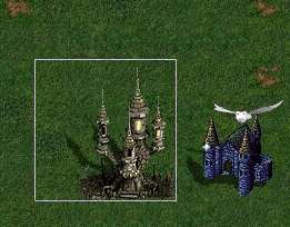
this is after doing a visual test:

as you can see, the biggest lightning graphic doesn't look good, but the smaller one does. i was going to say the cloud addition isn't worth it, but after checking with the smaller lightning, it doesn't seem so bad. i was going to scrap the cloud idea entirely. but if the cloud idea is scrapped, the lightning won't look right. what do you think, sal?
|
|
Salamandre


Admirable
Omnipresent Hero
Wog refugee
|
 posted March 04, 2014 06:50 AM
 |
|
|
Umm, no, I just uploaded the def so you can see the action. If you want to modify, you need the psd file HERE
Just keep the lightnings layers at base, so they are in the background, not over the tavern.
And if you can look at the bat home (contrast and base cut), it would help me a lot, so I only add the bats around then. Your tavern contrast was optimal.
____________
Era II mods and utilities
|
|
Salamandre


Admirable
Omnipresent Hero
Wog refugee
|
 posted March 04, 2014 06:53 AM
 |
|
|
fred79 said:
what do you think, sal?
I don't think the cloud is worth. Too small resolution in Heroes, can't have realistic things. And we can't have bigger than 128 because mapmakers already changed tavern properties (under/over) so anything bigger risks to change already done maps visuals.
____________
Era II mods and utilities
|
|
fred79

      
Disgraceful
Undefeatable Hero
|
 posted March 04, 2014 06:57 AM
 |
|
|
lol, i'm still not seeing the difference in quality, between the def frames pulled(which is what i did for the def on the screen i posted above), and a .psd file. like i said, any drop in quality can be fixed in photoshop. remember, i did the palace of dreams the same way i do everything else. i just added brightness and contrast, and walah, same as the .psd file quality. it all tranfers into the game the same way, and the graphics are the same in the end result.
but if you want me to stop with the tt, no prob. it would be a lot of additional work to add the cloud to the animation, as i would need to manually place it, and rework all the layers to fix it. it would be easier for me to just fix the home of the bat graphic. 
____________
|
|
fred79

      
Disgraceful
Undefeatable Hero
|
 posted March 04, 2014 06:59 AM
 |
|
Edited by fred79 at 07:01, 04 Mar 2014.
|
Salamandre said:
And we can't have bigger than 128 because mapmakers already changed tavern properties (under/over) so anything bigger risks to change already done maps visuals.
cool, less work for me. 
but as i was saying, the passability would be the same with a bigger box. the object is just higher in frames, is all. i did the same thing when i replaced the upgraded level 8 WoG dwellings'(that were animated, and higher) with the original dwellings in the higher box. i could do the same thing, in reverse, to the original dwellings.
____________
|
|
Salamandre


Admirable
Omnipresent Hero
Wog refugee
|
 posted March 04, 2014 07:01 AM
 |
|
|
keep it and add could then use it as free object. I am afraid the cloud will not be very popular in random maps. On custom, if you prepare around, ok.
Actually if you spend 5 minutes to look at psd you will see how easy is to animate this def. You combine background with one window light, this is one frame. Then change light, a second frame. Once you are bored with windows combinations, add a lighting frame. The difficult is when you have them all and need to make def.
Large choice of combinations.
____________
Era II mods and utilities
|
|
fred79

      
Disgraceful
Undefeatable Hero
|
 posted March 04, 2014 07:07 AM
 |
|
|
no, i mean, the cloud animation is a LOT of frames, to shrink and to place manually. i would have to keep error-checking, to make sure the cloud didn't move, is what i meant. that's where the difficulty would come from on my end.
i think i can fix the cloud to fit more into HoMM3, but it's not something i'm going to stress now, i have a lot of work to do as it is. i'll get back to you when i'm done cutting out the home of the bat.
|
|
Salamandre


Admirable
Omnipresent Hero
Wog refugee
|
 posted March 04, 2014 07:10 AM
 |
|
|
fred79 said:
the passability would be the same with a bigger box.
This is only the first aspect of the problem.
In editor you have the choice to change object properties (under/over). As tavern had the bat animation, I saw many maps using it as "under" so only the bat was visible, the base being hidden by something else. If you change the def size and moreover in the previous empty squares there is a cloud, those maps using the original tavern as modified decoration will be screwed.
Well, now they will have lightning, not much better, heh. 
____________
Era II mods and utilities
|
|
Macron1


Supreme Hero
|
 posted March 04, 2014 07:17 AM
 |
|
|
fred79 said:
as you can see, the biggest lightning graphic doesn't look good, but the smaller one does.
This don't look good, i think. Maybe lower cloud position to hide by it tower top?
|
|
fred79

      
Disgraceful
Undefeatable Hero
|
 posted March 04, 2014 07:33 AM
 |
|
|
i'm confused as to what you wanted from me with the home of the bat, sal. i'm uploading the original size, just cut. same format. i also found that, when you save the file as a .bmp, it both darkens and lessens the contrast on the object. but you can't save .png's with defs, right? so the only way to fix this, apparently, is to save as a .bmp, then brighten and recontrast the object, which is what i've done all along anyway.
is there a different method that you use, sal?
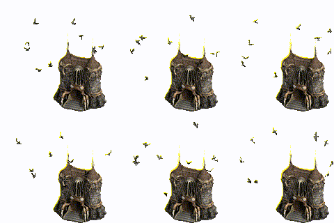
anyway, here's the home of the bat frame, original size, only with the edge errors fixed.
@macron: that idea was scrapped. thanks anyway for the input.
|
|
Salamandre


Admirable
Omnipresent Hero
Wog refugee
|
 posted March 04, 2014 07:41 AM
 |
|
|
I never change the png format until I make psd. You can work on png, then save as png. If you save a png transparent file as bmp, your transparent background is gone. As in the file I am downloading now.
Thanks 
Done.

|
|
artu


Promising
Undefeatable Hero
My BS sensor is tingling again
|
 posted March 04, 2014 10:07 AM
 |
|
Edited by artu at 10:08, 04 Mar 2014.
|
New bats and building looks good. Tavern also looks good but lose the lightning if you ask me, it looks horrible, no need to be obssessed about animation, some stuff is just fine as plain graphics.
The wizard schools are not bad but NOT BETTER than the original. I think the original is not ugly in this case. And the new bright one is too similar to Sorceress building.
|
| |
|
|


