|
|
Shalwend

 
Tavern Dweller
|
 posted July 23, 2011 09:29 PM
 |
|
|
Quote:
Quote:
Quote:
Plus, in this game, towns are still better than Heroes 1,2,3, and especially 4.
De gustibus non est disputandum but... you're really pushing it 
I'm just saying, for what towns have been in Heroes since the beginning, essentially a place to recruit units, there's no reason to have huge, amazing town screens. How long did you spend in towns? How long did you spend in towns having ENJOYMENT?
See, that's pretty much the point (as well). Besides substantial lack of touch and poor aesthetic quality - matter of taste, of course - there is no "being in town" anymore, at least not for me. Towns as instances are nonexistent atm.
I mean, what's the purpose of having all those gorgeous themes ? Just keep the background music playing when the little window pops up. Otherwise it's grotesque, almost like having a separate track for the inventory window.
____________
|
|
DarkLord


Supreme Hero
Fear me..
|
 posted July 23, 2011 10:43 PM
 |
|
Edited by DarkLord at 22:50, 23 Jul 2011.
|
Quote:
I'm just saying, for what towns have been in Heroes since the beginning, essentially a place to recruit units, there's no reason to have huge, amazing town screens. How long did you spend in towns? How long did you spend in towns having ENJOYMENT?
you say there is no reason to have Town Screens??? REALLY??
so if i follow your logic..
there is no reason to have town screens..! it's a place to recruit units!
there is no reason to have various music themes..! one "good" and one "evil" theme are enough!
there is no reason to have unique hero models..! paladin or knight doesn't matter, just change the stat's!
there is no reason to have creatures animations..! they don't affect on game mechanics!
there is no reason to have advanced 3D graphics on adventure map..! the game will be the same 3D or not!
there is no reason to have specific design and color theme of units..! who cares how they look, just show whats the HP and damage!
there is no reason to have art of artifacts..! show statistics it's enough!
there is no reason to have complex storyline..! no one cares about story anyway!
...and etc.
really????
that's the Game you want??? Blunt and Boring???
no i don't believe you!
is this the Town Screen-Window that you desire???

|
|
yasmiel


Supreme Hero
Former Chessmaster
|
 posted July 24, 2011 02:30 AM
 |
|
|
|
Actually that screen looks somewhat better than the current ones.
|
|
kusosaru


Hired Hero
|
 posted July 24, 2011 03:16 AM
 |
|
|
Quote:
Actually that screen looks somewhat better than the current ones.
Agreed 
While I usually don't care a lot about graphics and stuff - the town screens are 1 thing that is really really lacking Heroes 6.
But for me this has more practical reasons - back in H1-4 you could see how far a town has been upgraded just by looking at the town screen.
In H5 this was already somewhat harder depending on the town because the 3D screen forced you to fly around town to see all buildings (when I first played it I had troubles building units because I was used to click on buildings to recruit creatures until I found out that they also could be accessed through the menus below), but then the town screens really looked beatiful.
Now in H6 not only did we get ugly town screens - we also have a way toooo small town window where it's hard to distinguish between buildings that are upgraded, not upgraded, buyable or not buyable.
And another thing that annoys me about that is that at the same time they seem to have found the time to make video animations for creature attacks, hero attacks and town conversions that most players will deactivate after a few rounds because it slows down the game too hard.
|
|
Cleo


Hired Hero
|
 posted July 24, 2011 02:40 PM
 |
|
Edited by Cleo at 14:42, 24 Jul 2011.
|
Quote:
You won't find many softcore fans of a 16 year old game. Plus - the demonic cabal of the hardcore fans will always find a way to silence the innocents like the newcomers, the reviewers and force the otherwise bona fide devs and publishers to do their bidding. Sorry, either find yourself a good exorcist or surrender.
Maybe Ubisoft is wise not to let a bunch of raving nostalgia addicts decide every decision their development makes? 
Quote:
you say there is no reason to have Town Screens??? REALLY??
so if i follow your logic..
there is no reason to have town screens..! it's a place to recruit units!
there is no reason to have various music themes..! one "good" and one "evil" theme are enough!
there is no reason to have unique hero models..! paladin or knight doesn't matter, just change the stat's!
there is no reason to have creatures animations..! they don't affect on game mechanics!
there is no reason to have advanced 3D graphics on adventure map..! the game will be the same 3D or not!
there is no reason to have specific design and color theme of units..! who cares how they look, just show whats the HP and damage!
there is no reason to have art of artifacts..! show statistics it's enough!
there is no reason to have complex storyline..! no one cares about story anyway!
...and etc.
really????
that's the Game you want??? Blunt and Boring???
no i don't believe you!
I've never seen anyone blow anything so out of proportion in my life. I didn't say any of that, lol.
Old people, blinded by "the good old days", that's all this thread amounts to. Take off the nostalgia goggles and accept something different, the game is just fine without stupid town screens that add nothing to gameplay; it will change absolutely nothing.
|
|
admira


Promising
Famous Hero
|
 posted July 24, 2011 04:20 PM
 |
|
Edited by admira at 16:42, 24 Jul 2011.
|
ok guys guys this is getting ugly. Here is my 2 cents:
The town windows is ugly, yes no doubt about it. But one can say it has no connection or effecting gameplay in one way or another. But yes some people will say it is important part of the game that give atmospheric feels of different faction (I know I do). However, judging from the development comment there is a big chance it won't change the way it is now in Beta. Therefore I guessed, everyone should ask themselves whether this stuff is your deal breaker or not? if it is, you may cancel your order while it is still possible. As for me, I wait, currently the problem (and deal breaker) in the game for me is not only the town windows but also the game playability, bugs and balance. This will ultimately decide my final judgment whether I buy the game or this is the first Heroes series that won't be in my collection.
so stop this silly argument, yes I hate the current town windows, yes some of you didn't mind the town windows, the question is: "will you people who didn't mind the town windows would mind if there is a proper town screen?" if you don't mind, then let us people who do care to have a proper town screen do our work and you can peacefully leave the thread since whatever change happened according to this thread have none of your concern.
|
|
Fauch


Responsible
Undefeatable Hero
|
 posted July 24, 2011 05:38 PM
 |
|
|
|
tell me if I'm wrong, but I think I saw 2 sides. one that doesn't like the town windows, and one that doesn't care. I don't think I've seen even one person saying they are great. that really says how bad it is, when the most positive opinion is "I don't care"...
|
|
Nelgirith


Promising
Supreme Hero
|
 posted July 24, 2011 05:53 PM
 |
|
|
Quote:
tell me if I'm wrong, but I think I saw 2 sides. one that doesn't like the town windows, and one that doesn't care. I don't think I've seen even one person saying they are great. that really says how bad it is, when the most positive opinion is "I don't care"...
And yet, that won't change anything. They announced that Town Screens will remain like this at least until the game release. They might change in a patch ... or not.
So, as Admira said, you have to decide now whether you want to buy the game or not. You can cry as much as you want, it won't change anything.
I'm far more concerned by some broken game mechanisms and by the general boredom feeling they cause than by town screens. Town Screens can be patched or modded, broken or badly designed game mechanisms can't.
|
|
B0rsuk


Promising
Famous Hero
DooM prophet
|
 posted July 24, 2011 05:59 PM
 |
|
|
I won't buy Heroes6, and town pictures (not screens) are one of main reasons. I don't like the mechanics of H6. If H6 had beautiful town screens I would feel sad about it. But with town screens like this and the general art direction, I think Heroes1 looks better.
____________
http://www.youtube.com/watch?v=u5um8QWWRvo RSA Animate - Smile or die
|
|
lichking012


Known Hero
|
 posted July 24, 2011 06:04 PM
 |
|
|
Personally, I'm not a fan of the window at all, but I don't think that the images are that bad, definitely not any worse than something like heroes 5 Necropolis or Dungeon. Whilst I would prefer a new interactive town window in the spirit of heroes 3, I don't see that as a realistic possibility at this point. Upping the resolution on the current animations and maybe adding all of the buildings so that it is full screen seems workable to me. I don't think that the towns look like crap. Most of them look pretty ok. People claiming that the images are "worse than heroes 1" are just being ridiculous. 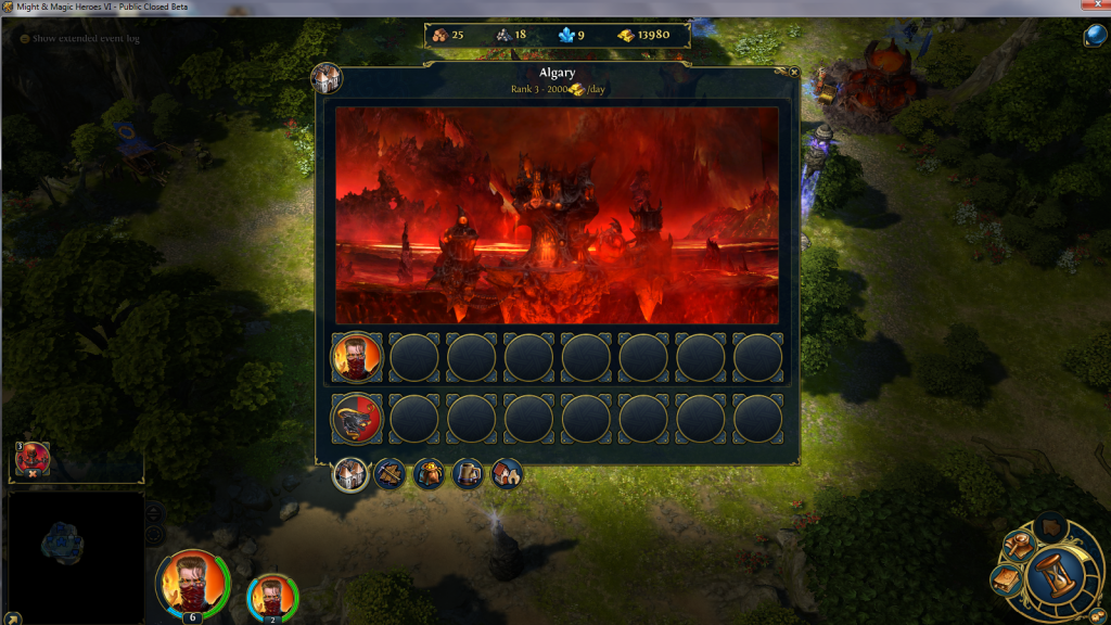 There is no way that this early level inferno town doesn't look better than this There is no way that this early level inferno town doesn't look better than this . Sure one has cartoonish charm, but that's about all it has going for it. Heroes 4 was hit and miss, but it's hard to deny that this, infernopolis, looks like crap, . Sure one has cartoonish charm, but that's about all it has going for it. Heroes 4 was hit and miss, but it's hard to deny that this, infernopolis, looks like crap,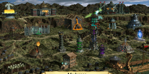
|
|
kusosaru


Hired Hero
|
 posted July 24, 2011 06:28 PM
 |
|
Edited by kusosaru at 18:34, 24 Jul 2011.
|
Out of those:
The Heroes 6 one looks like an ugly mix of red and black and I can't even identify half of what is on the screen just because it's just a mishmash of colors.
The Heroes 1 one is simple and well for a game that is more than 10 years old it looks ok.
The Heroes 4 one has every building in a separate place and easily accessable - while not he most beatiful screen it has some order.
Out of those I'd say the H6 one is by far the worst !_!
Quote:
I'm far more concerned by some broken game mechanisms and by the general boredom feeling they cause than by town screens. Town Screens can be patched or modded, broken or badly designed game mechanisms can't.
Agreed the town screens are not the main problem here, but they are one of the things that makes this game feel like it's no longer a HoMM game, but something entirely different. (and far less appealing)
|
|
GenyaArikado


Bad-mannered
Supreme Hero
|
 posted July 24, 2011 06:47 PM
 |
|
|
Quote:
 There is no way that this early level inferno town doesn't look better than this There is no way that this early level inferno town doesn't look better than this
One was made in 1995 and the other was made in 2011. See the difference
|
|
Warmonger


Promising
Legendary Hero
fallen artist
|
 posted July 24, 2011 07:17 PM
 |
|
|
^IMHO Inferno looks by far better in terms of design and overall graphical quality, but shows nothing. I could set it as an abstract wallpaper on a bad day... if it was bigger, that is.
____________
The future of Heroes 3 is here!
|
|
alcibiades


Honorable
Undefeatable Hero
of Gold Dragons
|
 posted July 24, 2011 07:31 PM
 |
|
|
If it was full screen so one could actually make out what the image shows, I wouldn't even object that much. But in that small window inside the map, it isn't even atmospheric. 
Heroes 1 might look cartoonish and simply by todays standards, but at least it has atmosphere and charm and you can actually get some information from it.
____________
What will happen now?
|
|
kusosaru


Hired Hero
|
 posted July 24, 2011 07:45 PM
 |
|
|
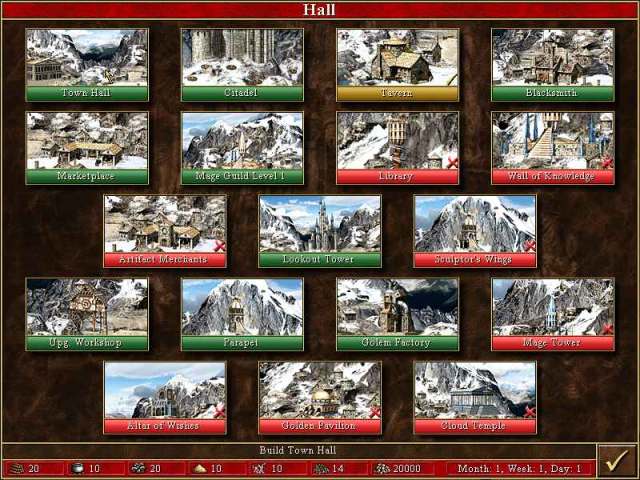
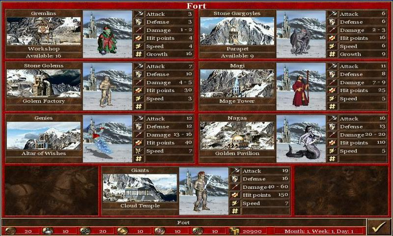
And the new building / recruitement windows compared to good old ones:
Gone are the times where buildings had a picture.
Gone are the times when the recruitement screen was so big that it also included unit stats.
|
|
Dave_Jame


Promising
Legendary Hero
I'm Faceless, not Brainless.
|
 posted July 25, 2011 11:47 AM
 |
|
|
One fact is, that the inferno TW is the best looking of them All.
I partly like the designe, but do not like the On map look of the town. But the TW, if it would be Fullscream, nad the individual building would stand out. It woudl be nice.
But this is inferno. The one that looks the best. Looked at Heaven, Necropolis, Sanctuary?
Sanctuary had a very good design,and in my eyes has the best on map look. But the TW? A blurry something on a blue field, that showes no detail and has no atmosphere.
Why is it so hard to just take the CA and put a interactiv form of it into the TW. I Think that would be the easyest and best way to solve this situation.
____________
I'm just a Mirror of your self.
We see, we look, we gather, we store, we teach.
We are many, and you can be one of us.
|
|
Avirosb


Promising
Legendary Hero
No longer on vacation
|
 posted July 25, 2011 12:01 PM
 |
|
|
So I'm back from my little vacation (during which I [re]bought Heroes 3&4 once again),
and this little problem still hasn't been fixed. It figures 
Hm ... Should I blame Black Hole for their lack of vision or Ubi for lack of supervision?
Decisions, decisions...
|
|
Zenofex


Responsible
Legendary Hero
Kreegan-atheist
|
 posted July 25, 2011 12:04 PM
 |
|
|
Quote:
Maybe Ubisoft is wise not to let a bunch of raving nostalgia addicts decide every decision their development makes?
Tell me something - what do you have against getting proper town screens except your "I don't understand" reasoning which frankly has no reason in it?
And where did you get the impression that this is about a "bunch"? The only "bunch" I see is composed of some confused proponents of the town windows which can't even explain why they like them and not the town screens to which you definitely belong.
|
|
Brukernavn


Hero of Order
|
 posted July 25, 2011 01:31 PM
 |
|
|
Quote:
And the new building / recruitement windows compared to good old ones:
Gone are the times where buildings had a picture.
Gone are the times when the recruitement screen was so big that it also included unit stats.


I think these are very important points that have disappeared in the town window "debate". It's claimed to be all about visual and atmosphere, but that's not all the town screens are about. They are about functionality, effectiveness and information. And the town windows have nothing of it!
In H3 you could cast one glance at the town screen and see just what dwellings were built and so on. You had detailed information about growth and creature statistics. All of this is gone now!
Nothing is faster in the town window, if anything it's less intuitive and more confusing. This issue is tightly connected to the UI problems, and how everything in the game is placed in a freaking WINDOW! Give us full screens instead of having many tabs with little information and tiny round buttons (for instance the buy-building buttons). The windows are not faster in any way compared to any of the previous installments. They are uglier, less inviting, less intuitive, less informative, smaller and slower than any of the previous installments. It's a fail on all accounts, yet Ubi wants to release the game in this condition.
Give the devs anough time to make proper town screens! I would gladly wait until christmas, and it would be a nice marketing move as well. I won't be buying the game before it's finished anyway...
|
|
Cleo


Hired Hero
|
 posted July 25, 2011 04:53 PM
 |
|
Edited by Cleo at 16:54, 25 Jul 2011.
|
Quote:
Quote:
Maybe Ubisoft is wise not to let a bunch of raving nostalgia addicts decide every decision their development makes?
Tell me something - what do you have against getting proper town screens except your "I don't understand" reasoning which frankly has no reason in it?
And where did you get the impression that this is about a "bunch"? The only "bunch" I see is composed of some confused proponents of the town windows which can't even explain why they like them and not the town screens to which you definitely belong.
I already told you that: development time is better spent on gameplay, not useless town screens which add nothing to gameplay. You will spend most time on the adventure map and in combat, having more classic town screens will do nothing to enchance your overall experience besides make you more nostalgic. Now that mage guilds are gone, there's even less necessity to towns.
Plus, lets be honest, the only people upset with HoMM6 are old fans which can't tolerate new ideas. It's the classic problem of the old to be opposed to the new, regardless of how it actually affects them. Lol, the funny thing is that it's not Ubi's problem, it's yours. 
|
| |
|
|


